Hello everyone and welcome to the final chapter in this particular exploration. We started off with describing the concepts of modularisation, moved on to extracting geometrical data from recorded movements, went off on a slight tangent to illustrate an extraction based on sound and how that can be developed, and finally discussed some of the ways that data and diagrams can be drawn up from visual representations of the recorded movement.
Here I aim in providing you with the method I followed to generate a final structure from the movement analyzed which had to tick certain usability boxes, namely :
- A seating area
- A place where one could lie down
- Shelter
So without further ado :
UNIT 5 - FROM ANALYSIS DIAGRAMS TO A FINAL PROPOSAL
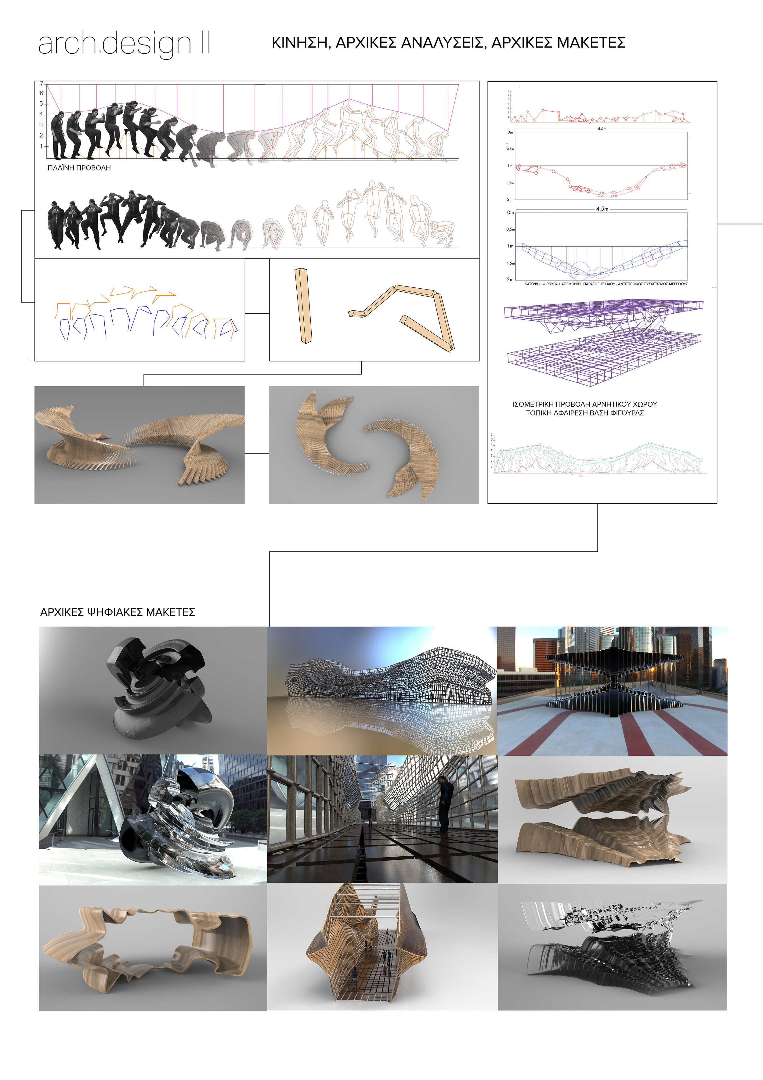
In the previous post I had mentioned that I had finally settled down on using the skeletization diagram of the sketched figure to create my modular building block. Below is the analyses that was used :
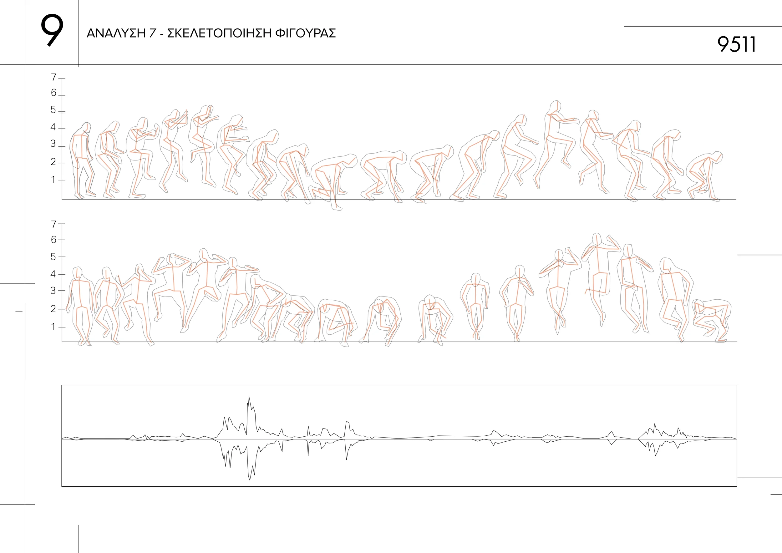
Diagram illustrating the skeletization of the figure carrying out the motion
Armed with the decision to follow this methodology, the best thing to do would be to test it through making various forms. There may be a few out there who believe that most designs are fully done within 3d modelling software - I was one of these people prior to starting the degree - but using software sometimes gives you the illusion of speed.
For example, the figure above, even simplified to the 12 elements per frame, would end up being a logistical nightmare within a program such as 3dsmax, especially considering that, at this stage we're still exploring initial forms. Therefore, almost counter-intuitively, I opted for a more hands on approach using a hot glue-gun and a bunch of wooden skewers.
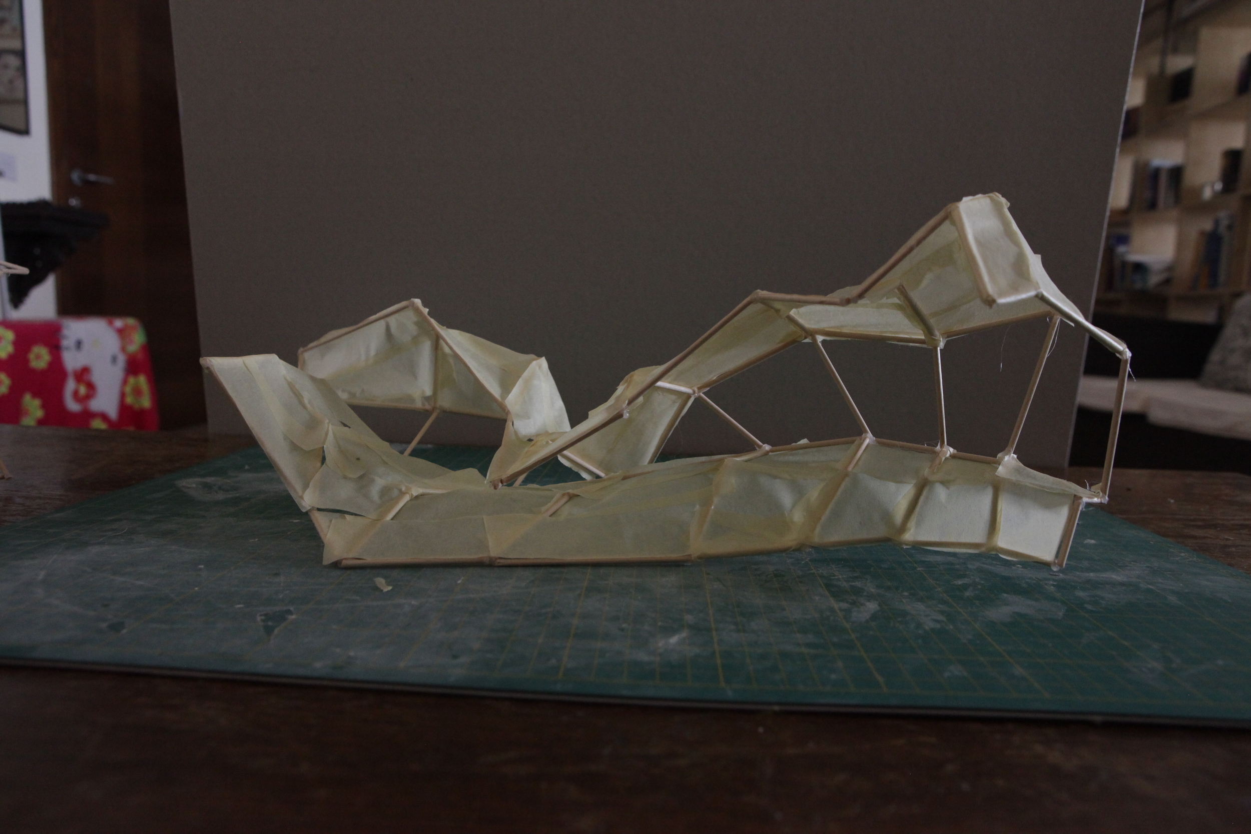
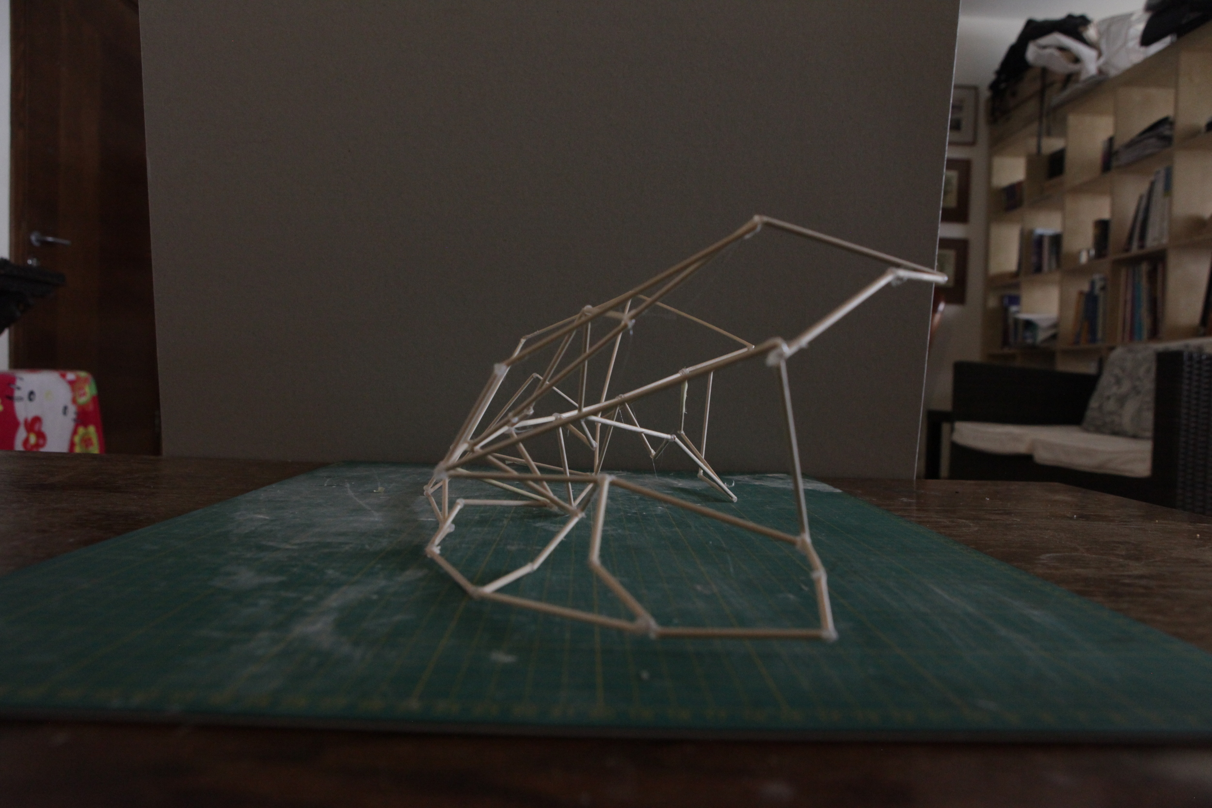
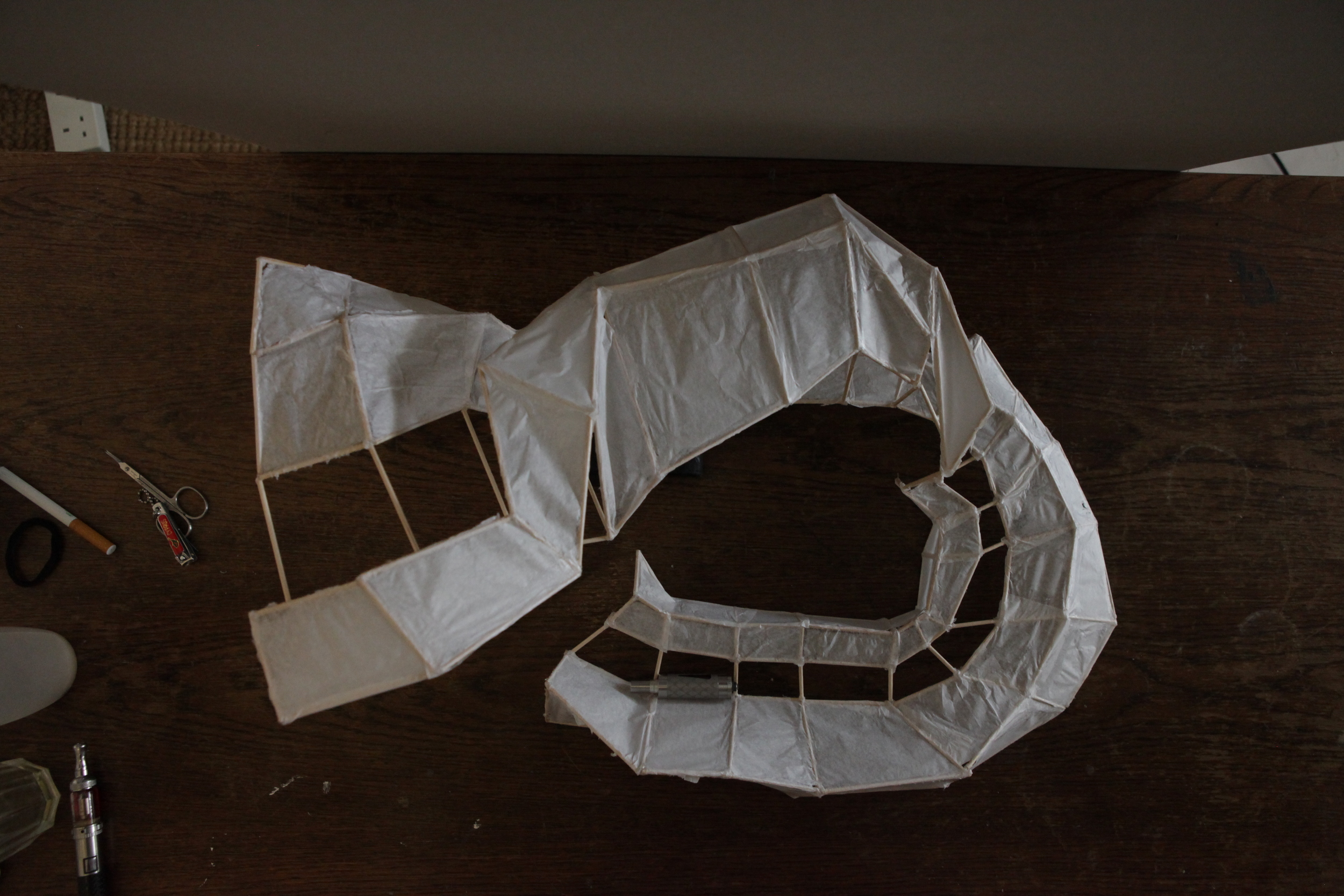
To begin with I opted for a more literal translation of the movement and came up with this initial abomina-ahem model :
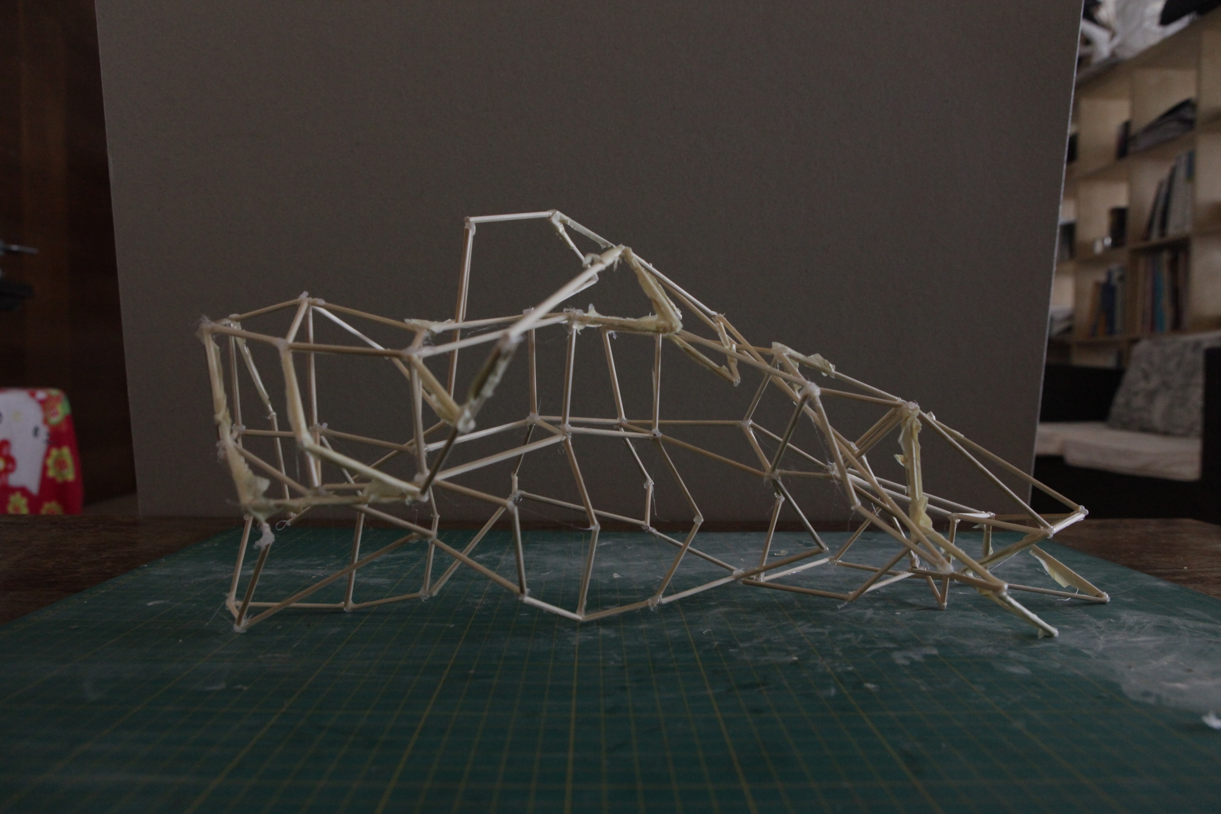
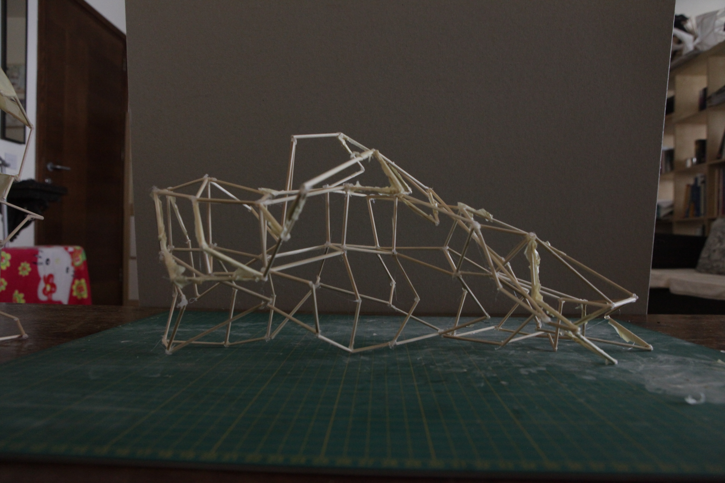
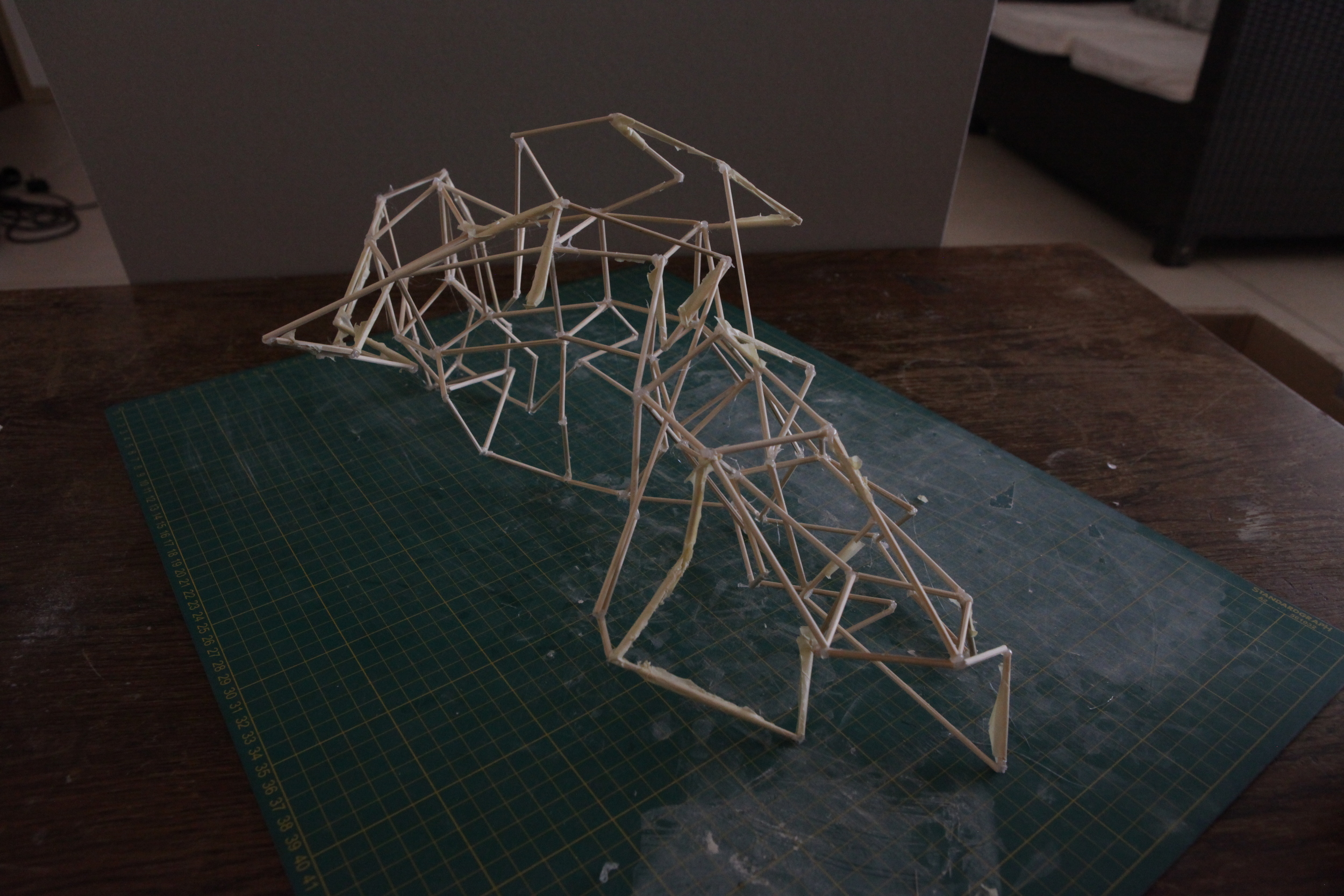
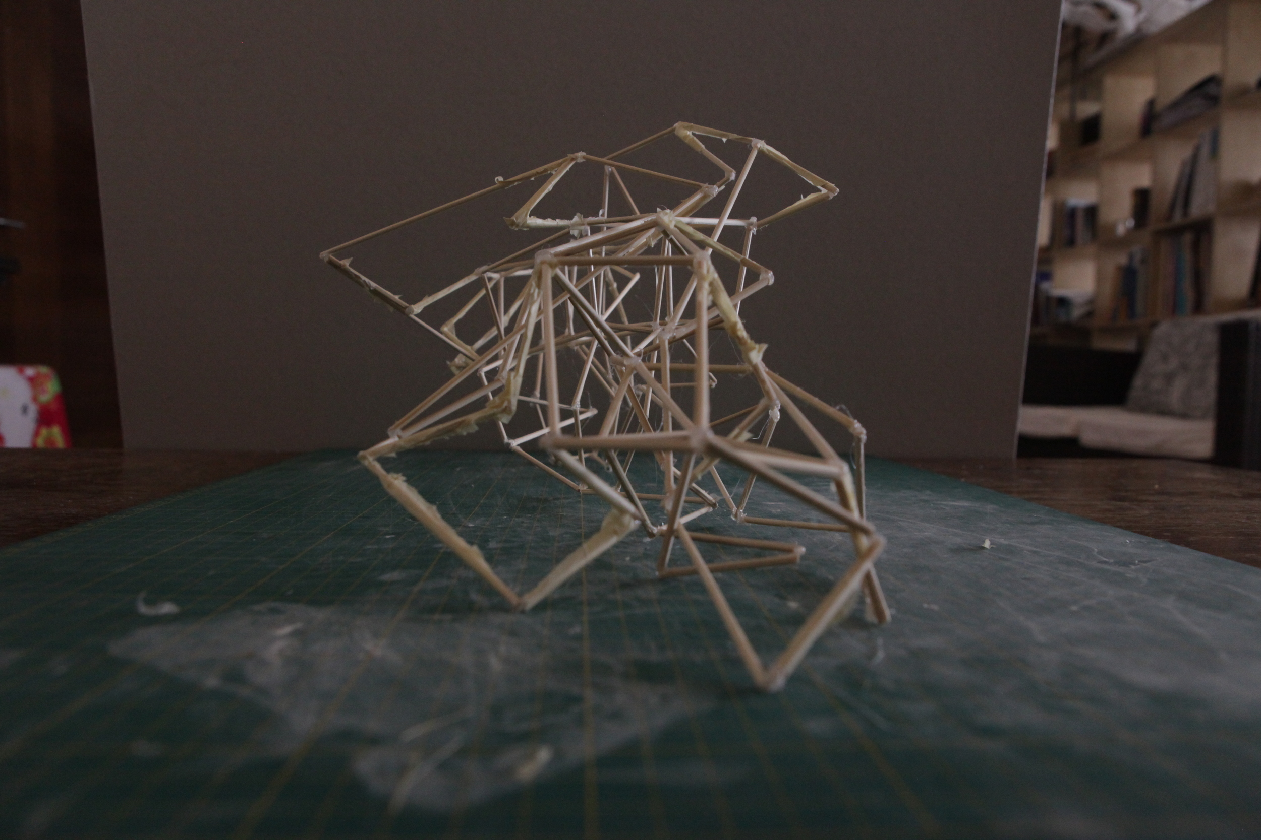
Granted, it doesn't really look like much, but that's besides the point as it's purpose is to simply test the idea of using the entire form (sans head in the above). In the above I attached each figure frame at the shoulders, hands, hips and feet to create a skeletal tunnel of sorts. Although, the apparent complexity was initially appealing, the model failed to consistently meet the requirements of the final model - a place to sit, shelter and a place to lie down.
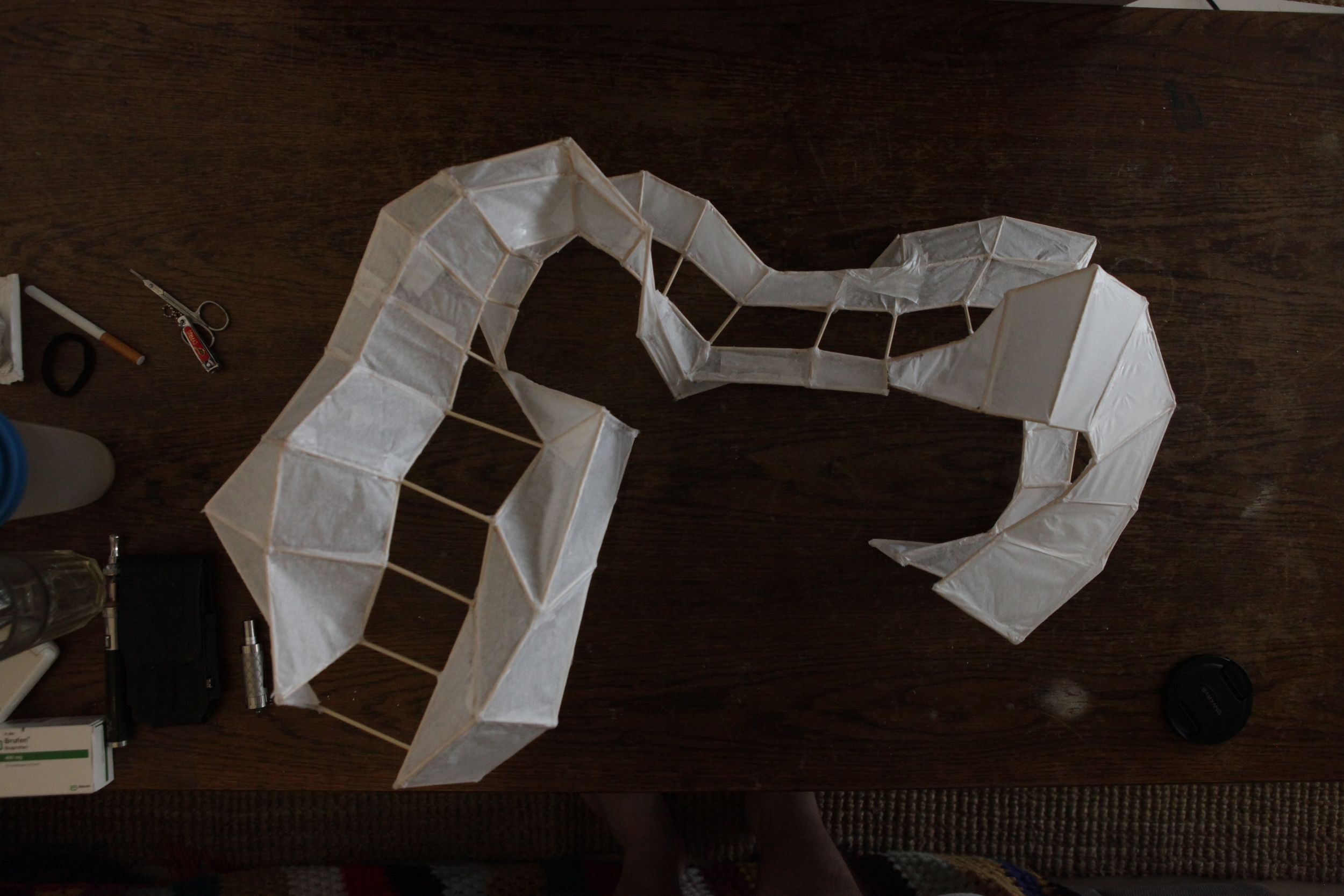
This was primarily identified to be due to far too many elements being used. Remembering Mies Van der Rohe's famous adoption of 'Less is More', I simplified by further deconstructing the motion to its core fundamentals. I decided to split the figure vertically in half generating a total of 5 movable parts - forearms, arms, torso, upper leg, lower leg. This is illustrated in the sketch below :
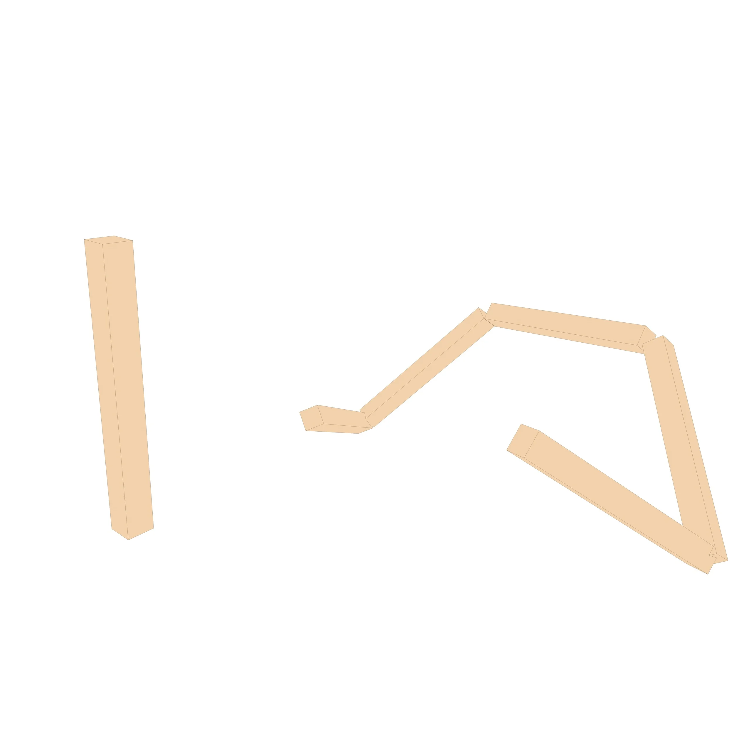
Simplification of the figure to 5 parts
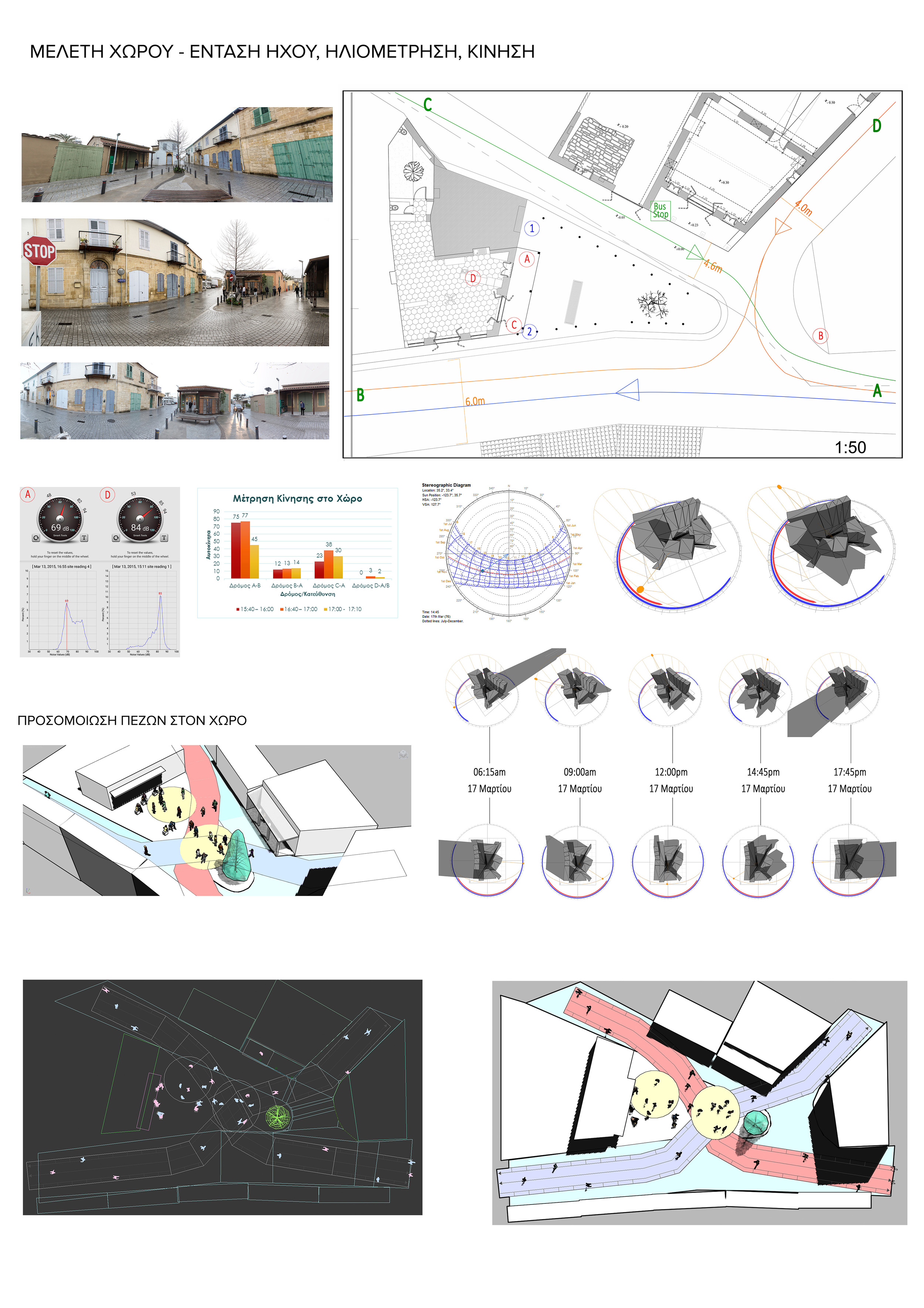
SIDE BAR : Brief Site Analysis Overview
At this point, we had visited the site and gathered the information we deemed as appropriate. I won't go into great depths, suffice to say that it was a small open square surrounded by fairly tall buildings all around, with a popular, picturesque cafe situated at the one end. It is best illustrated in the panoramic image below :
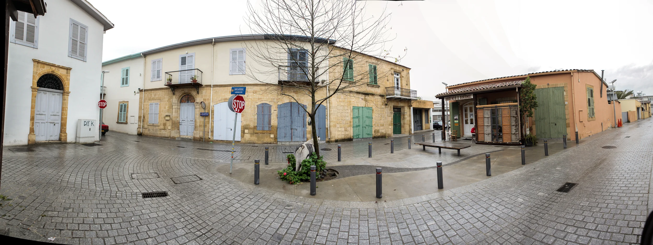
A panorama of the square where the proposal would be placed
From the site visit, a number of variables where recognized as important. These can be summarized as follows :
- Traffic (and as such noise generation) was noticed primarily on the north road
- The space is completely open and as such in dire need of shelter, especially during the summer months where temperatures regularly exceed 40C
- Pedestrian traffic is prevalent throughout, especially considering that on occasion the roads are closed for various festivals and activities
The following analyses were done based on the surveying the site :
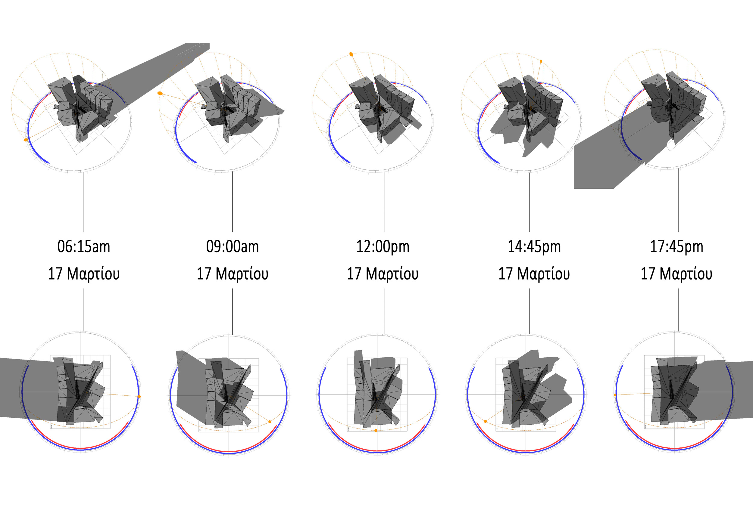
Basically a sun course analysis was carried out to illustrate how the square is exposed to sunlight and a series of dB readings were taken at points A through D which illustrated the aforementioned point that the north road is exposed to largest noise readings due to the increased motor traffic.
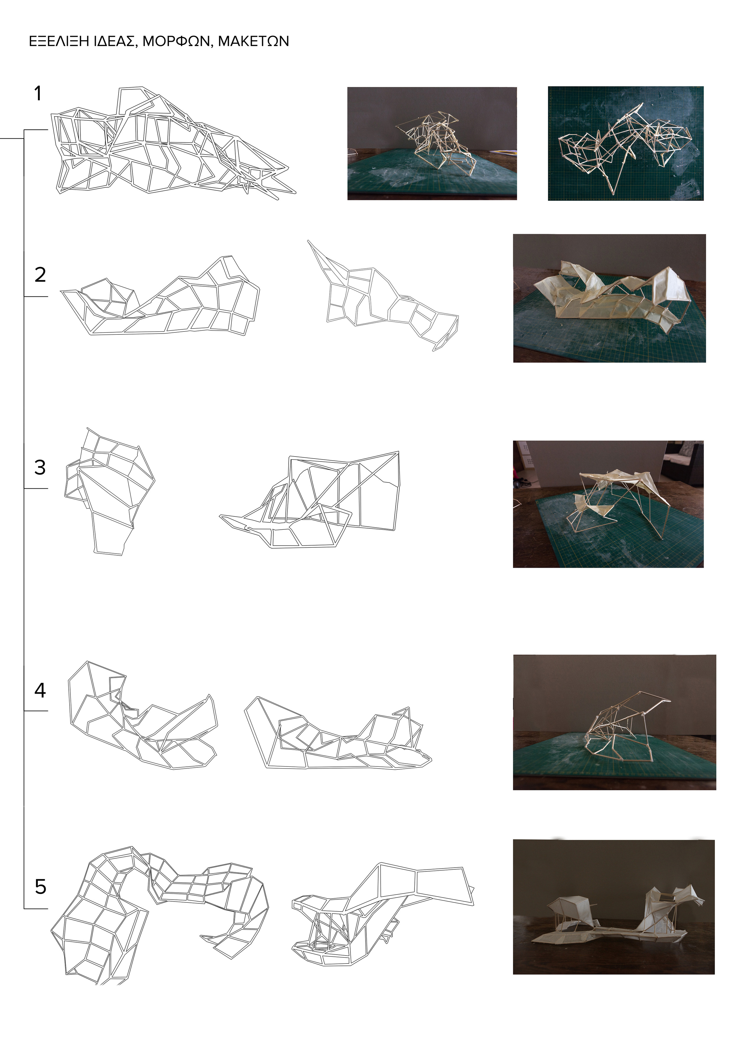
Having carried out this site analysis, and most importantly having set measurements to work with, I proceeded to making a series of models that would best suit the site.
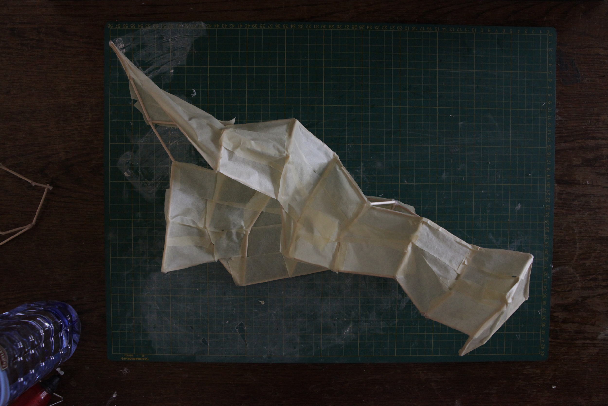
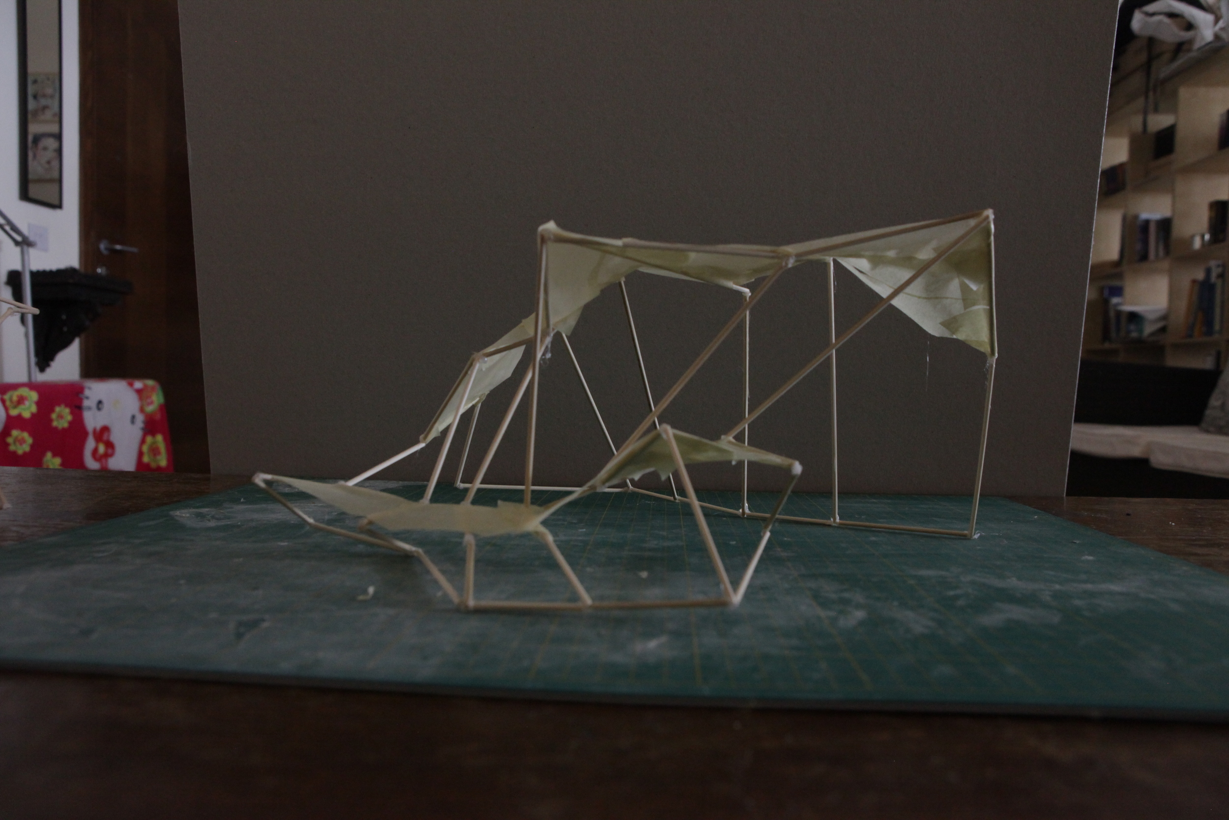
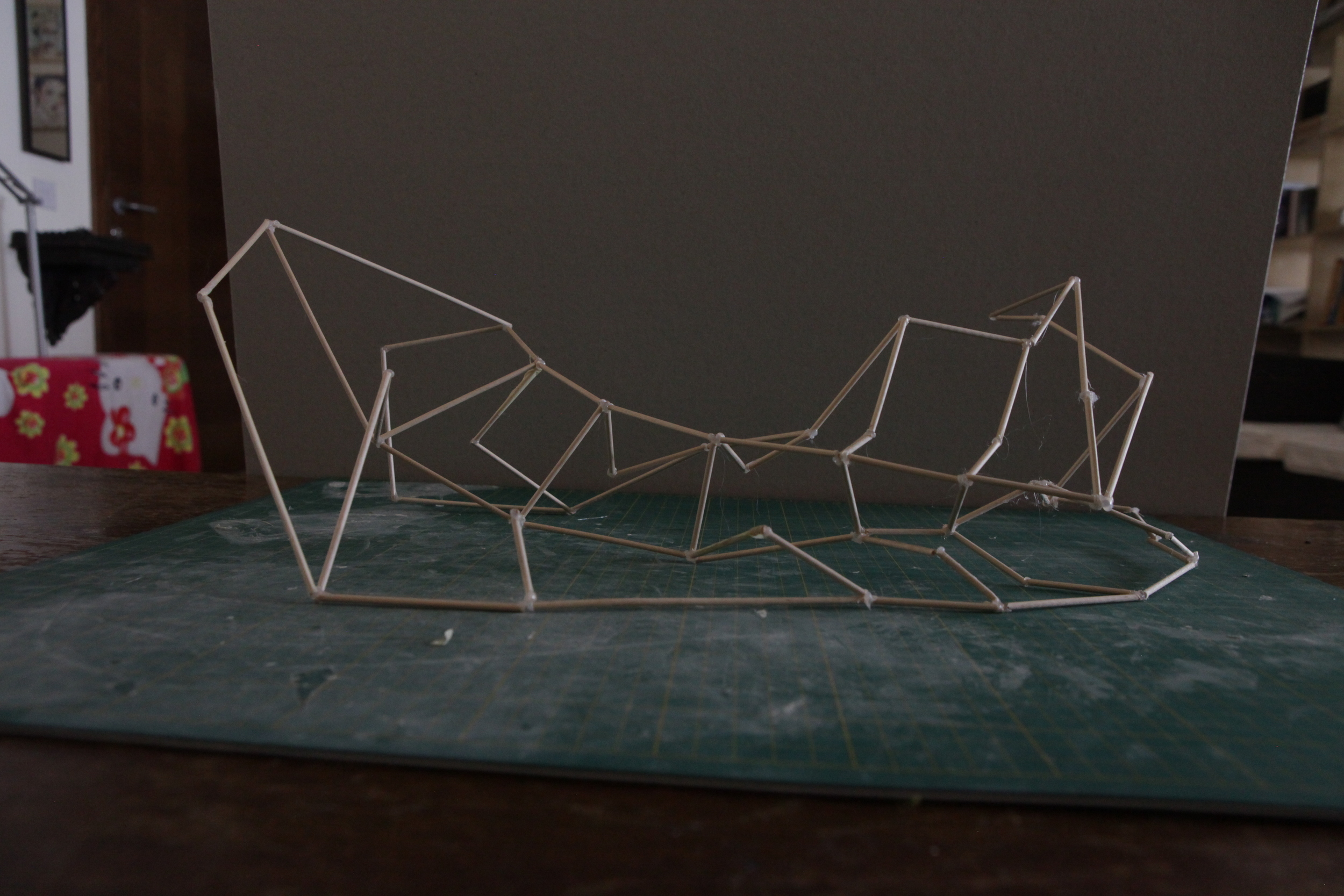
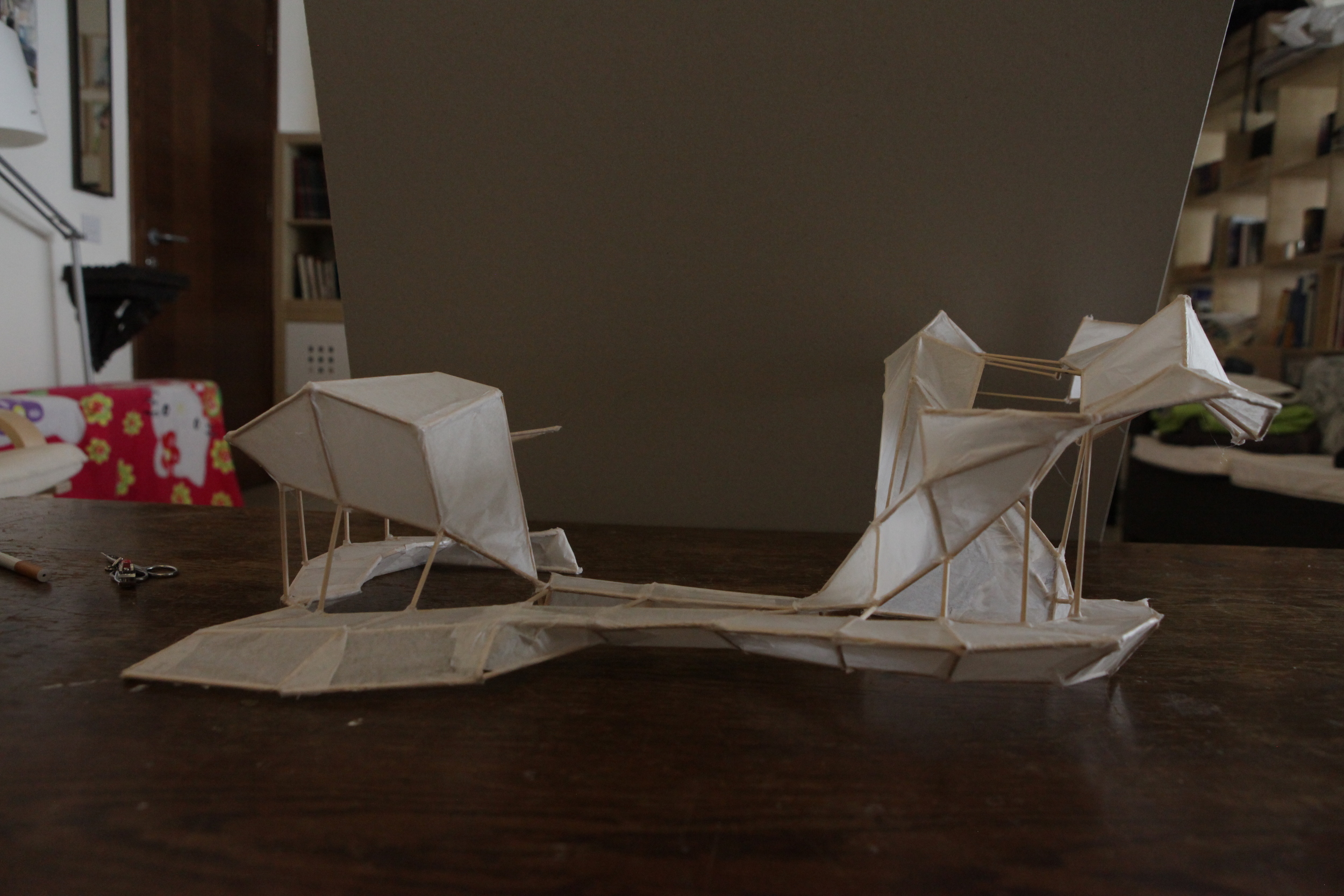
The above show a more conservative approach to covering the area provided, thinking in terms of a standalone unit instead of something that would drastically reform the dynamics of the square. I break the form and rotate it around to create certain spaces and explore how the space is affected by my thought process.
This is crucially important to the overall design process, along with the self-imposed realization that no idea should be considered 'holy'. A way to tackle that is to limit the time spent per iteration, keeping it to around 30-60mins for each one, so that one avoids falling into the sunk-cost fallacy and ends up committing to a broken idea. Hence, I didn't care about the overall look of each model, whether it was messy or not - speed and thought development were of paramount importance.
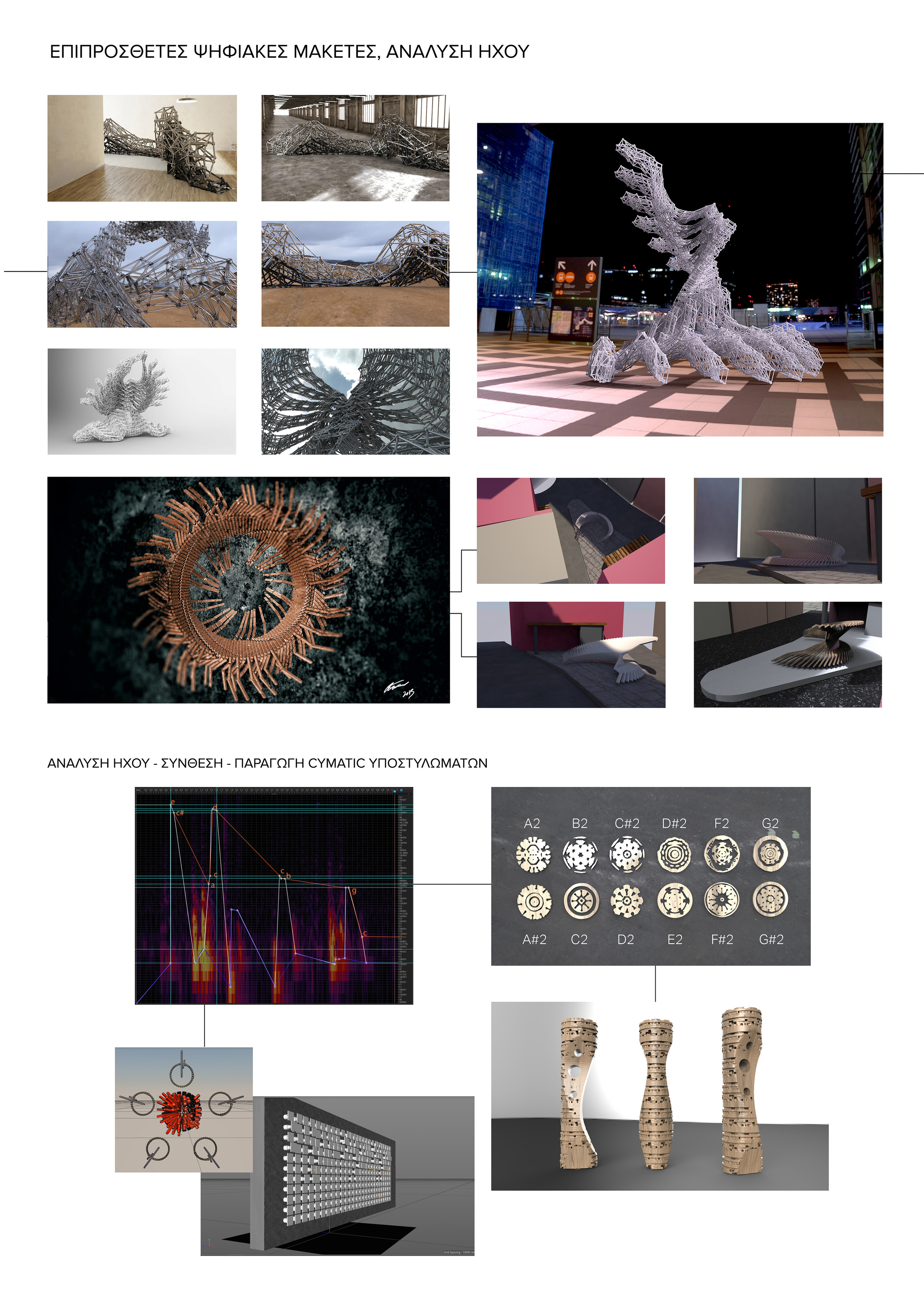
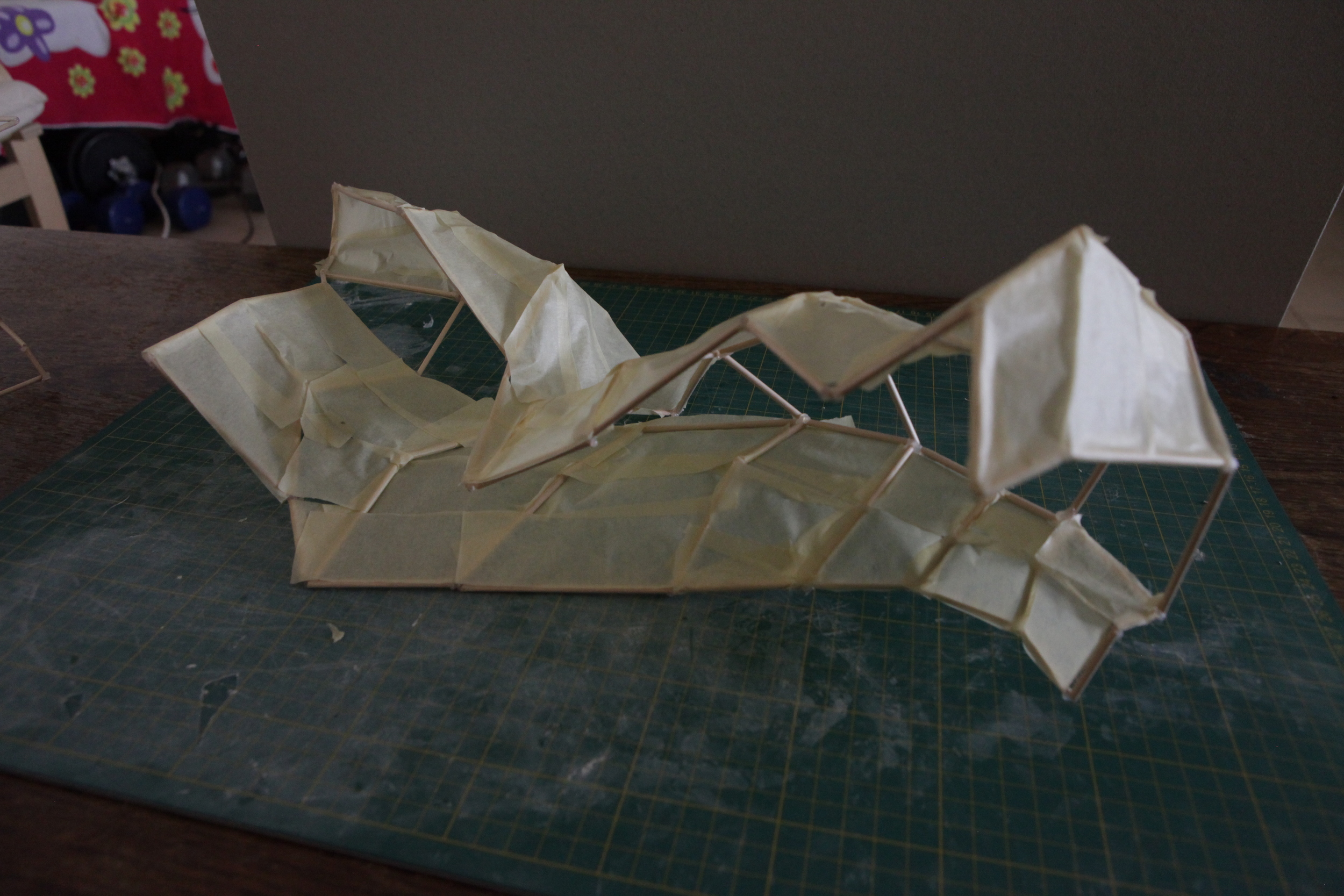
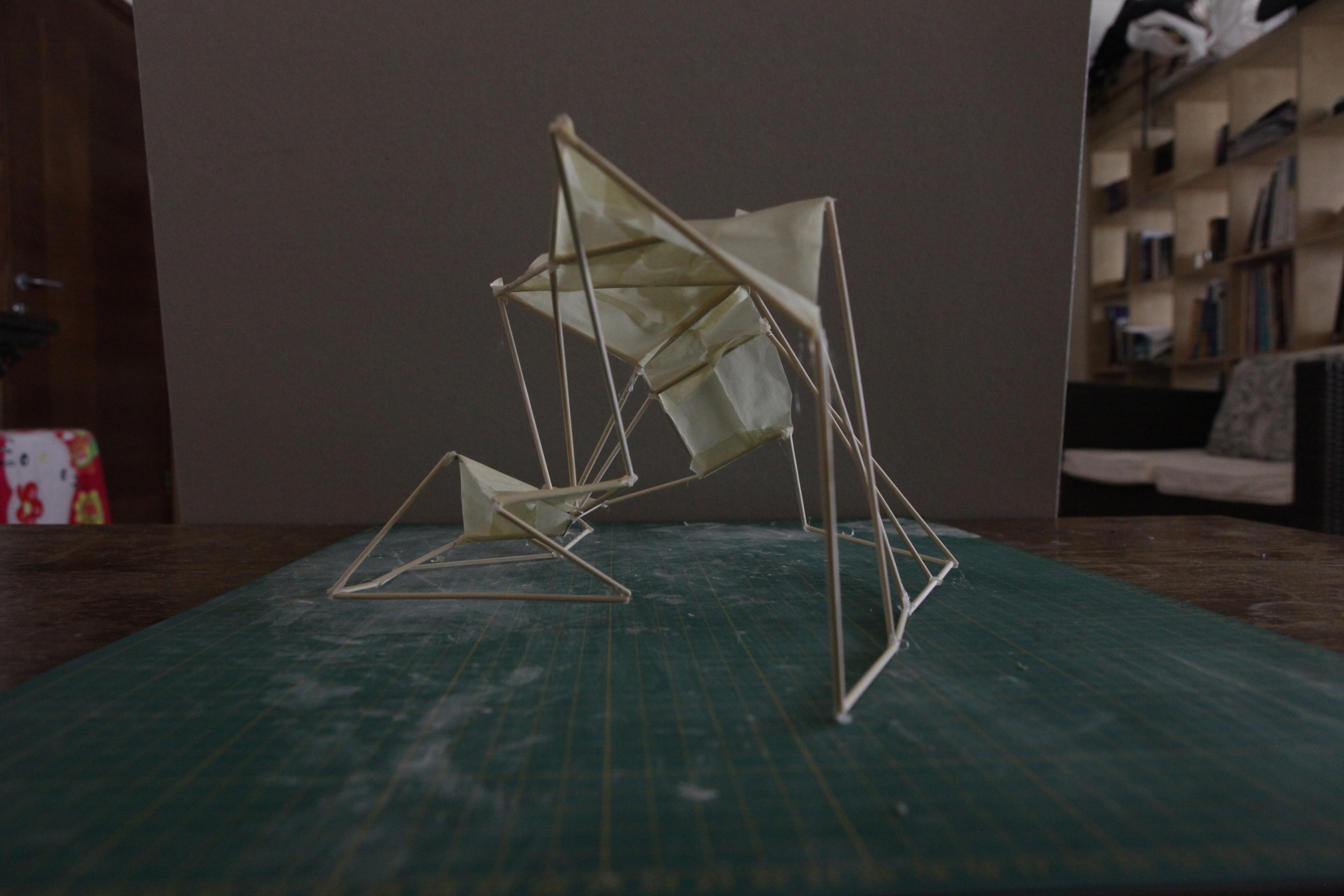
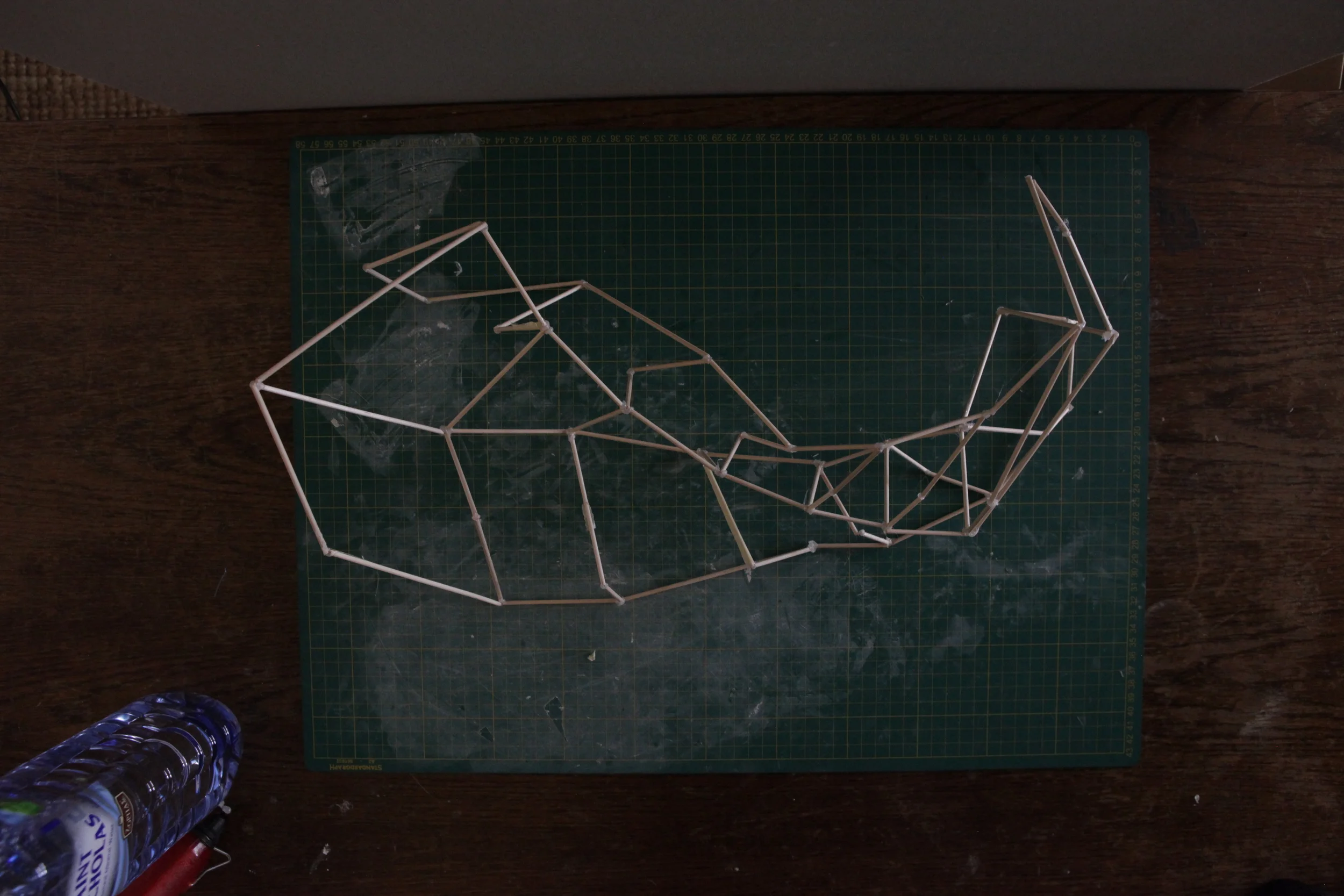
This iteration-based approach led to me thinking about a more all-consuming approach to the architectural idea - I aimed to transform the spatial dynamics of the square instead of offering a simple, semi-sculptural seating area. This lead to the following idea :
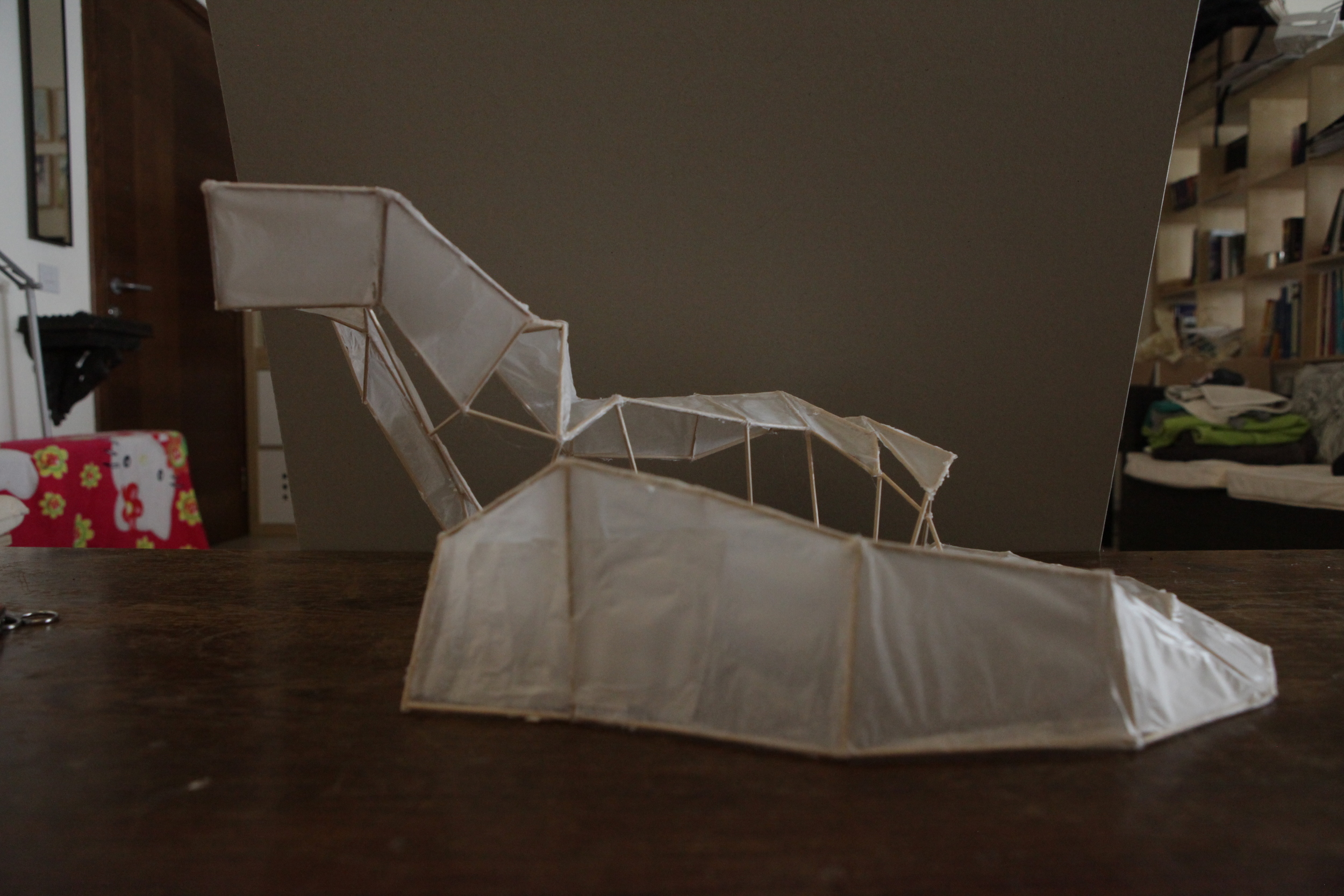


The above illustrates a larger suggestion which would cover the entire square, offering seating areas and shelter, without blocking line-of-sight across the square, primarily facilitated by keeping the middle part of the deforming 5 part unit uncovered.
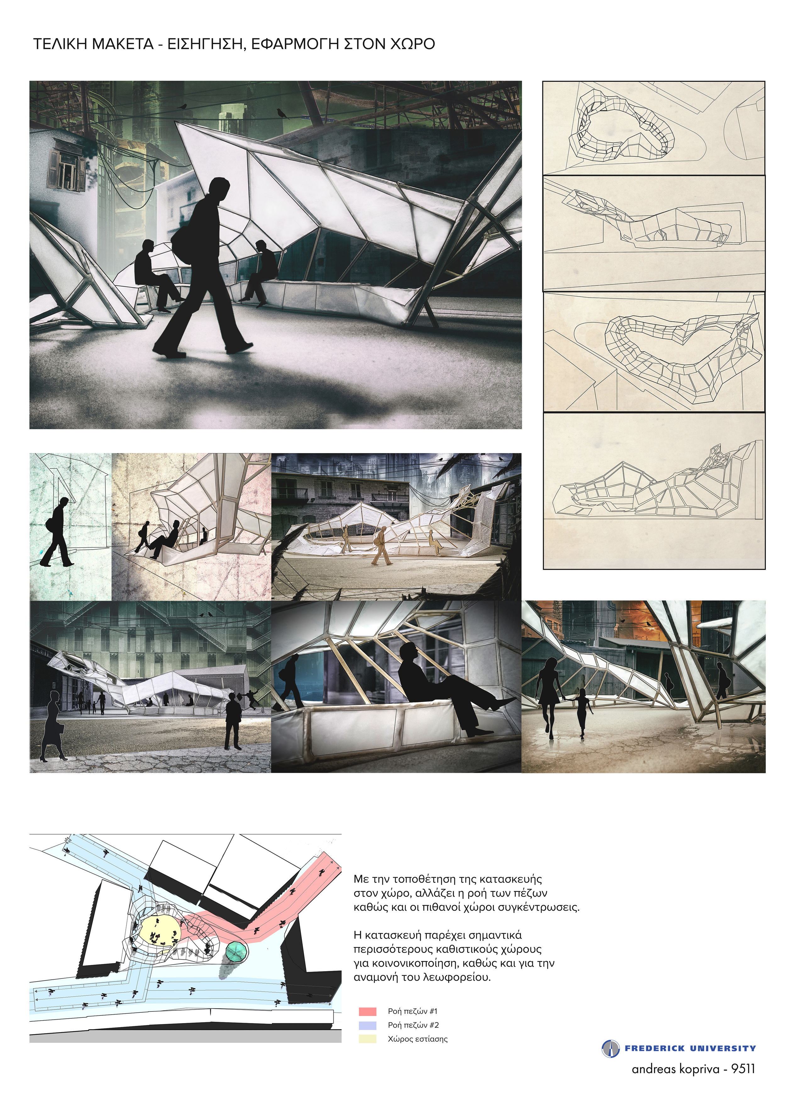
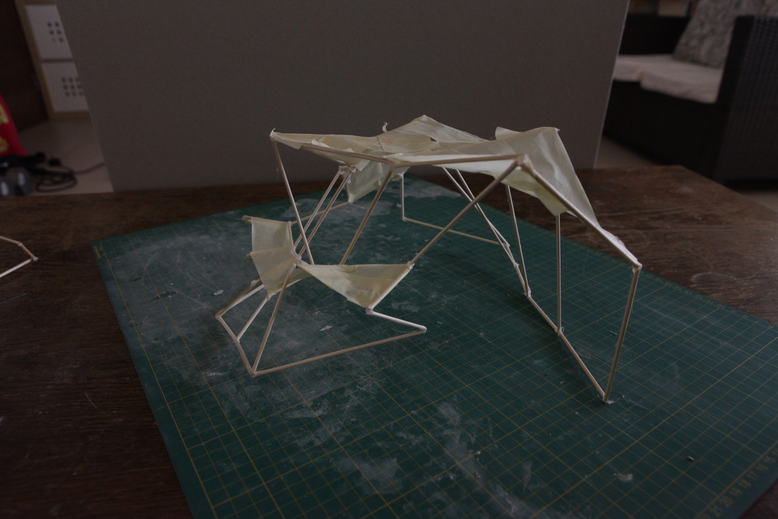
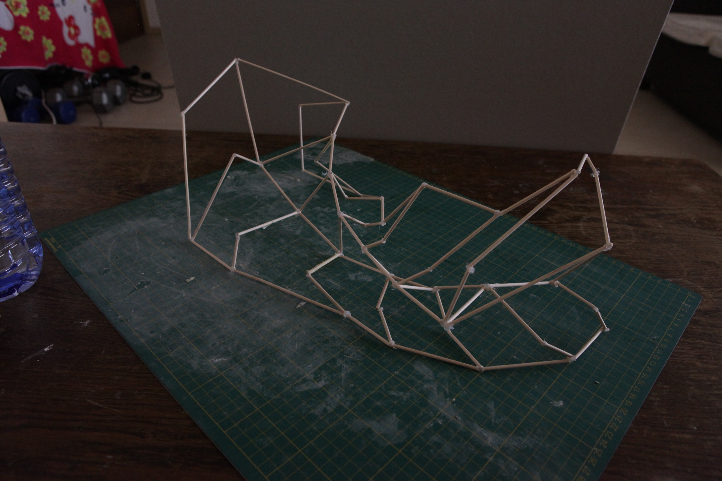
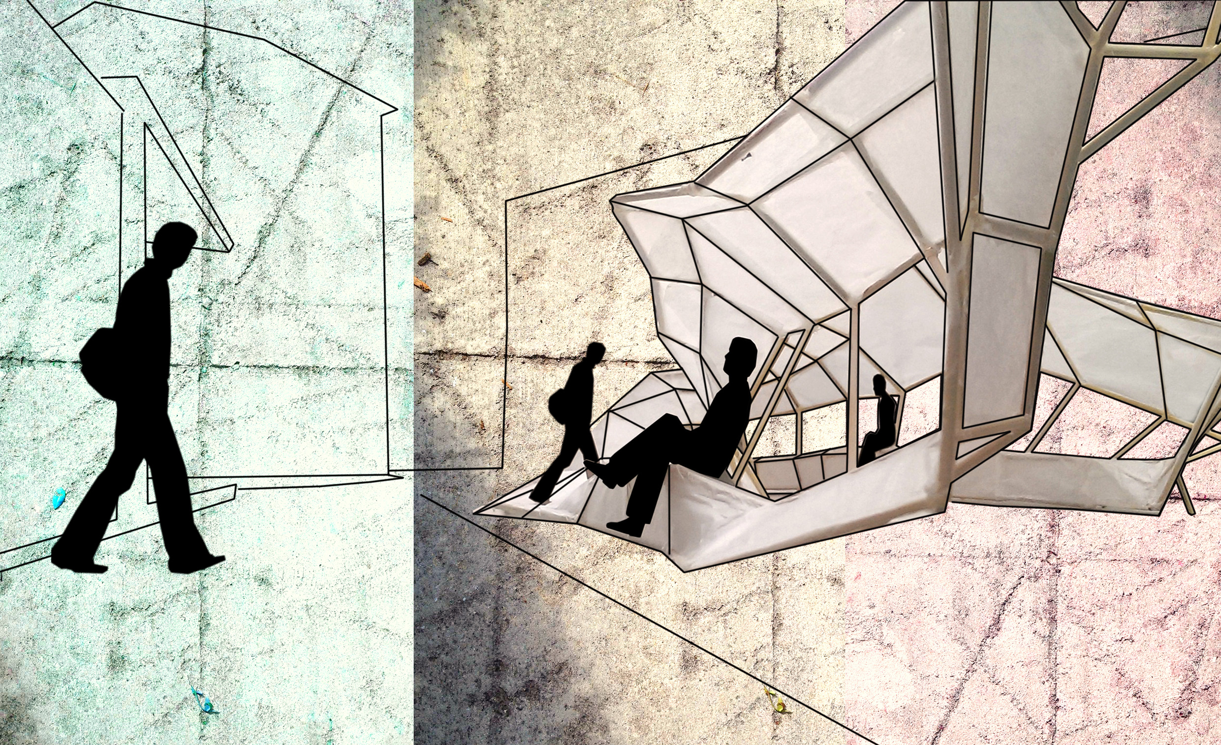
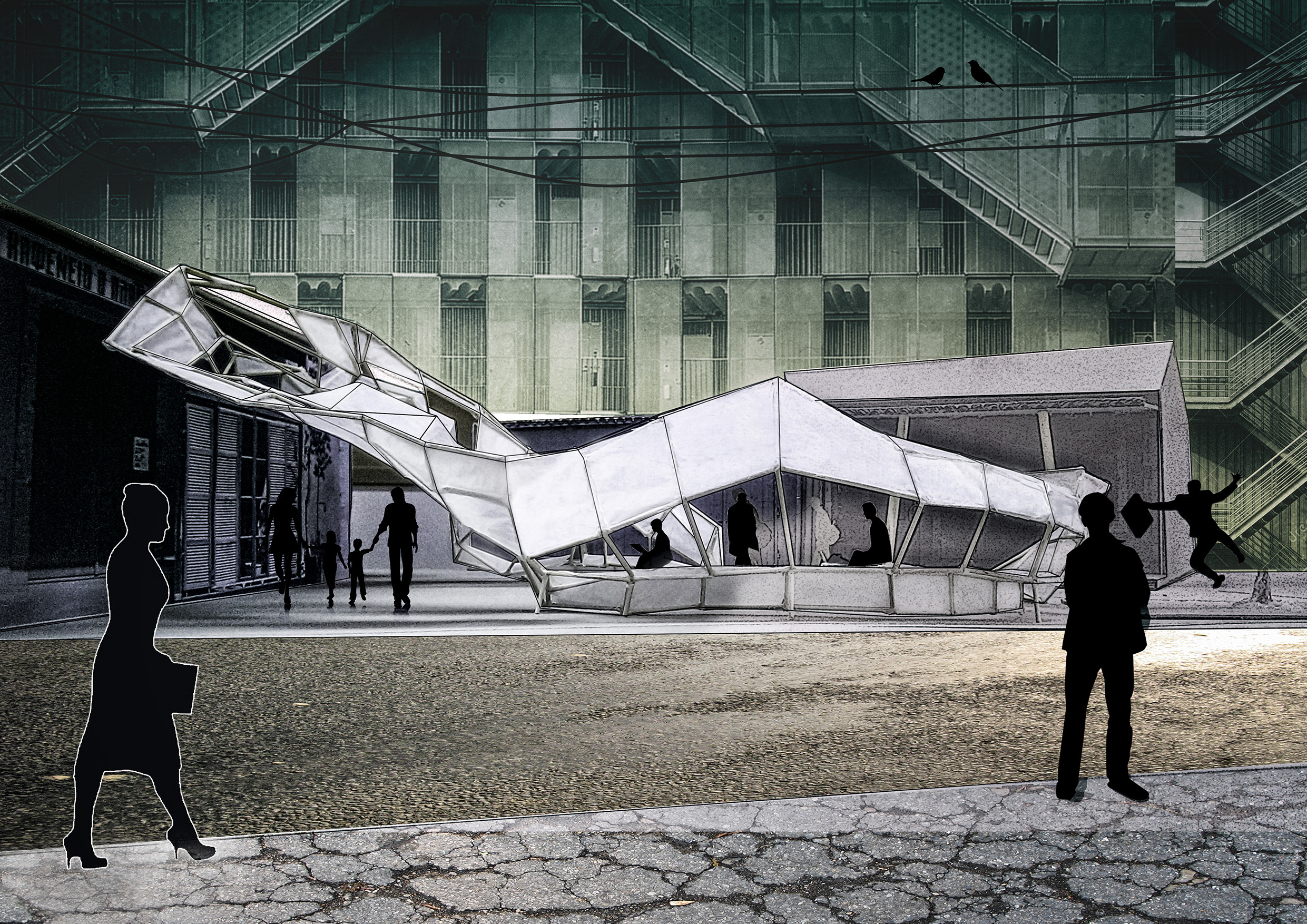
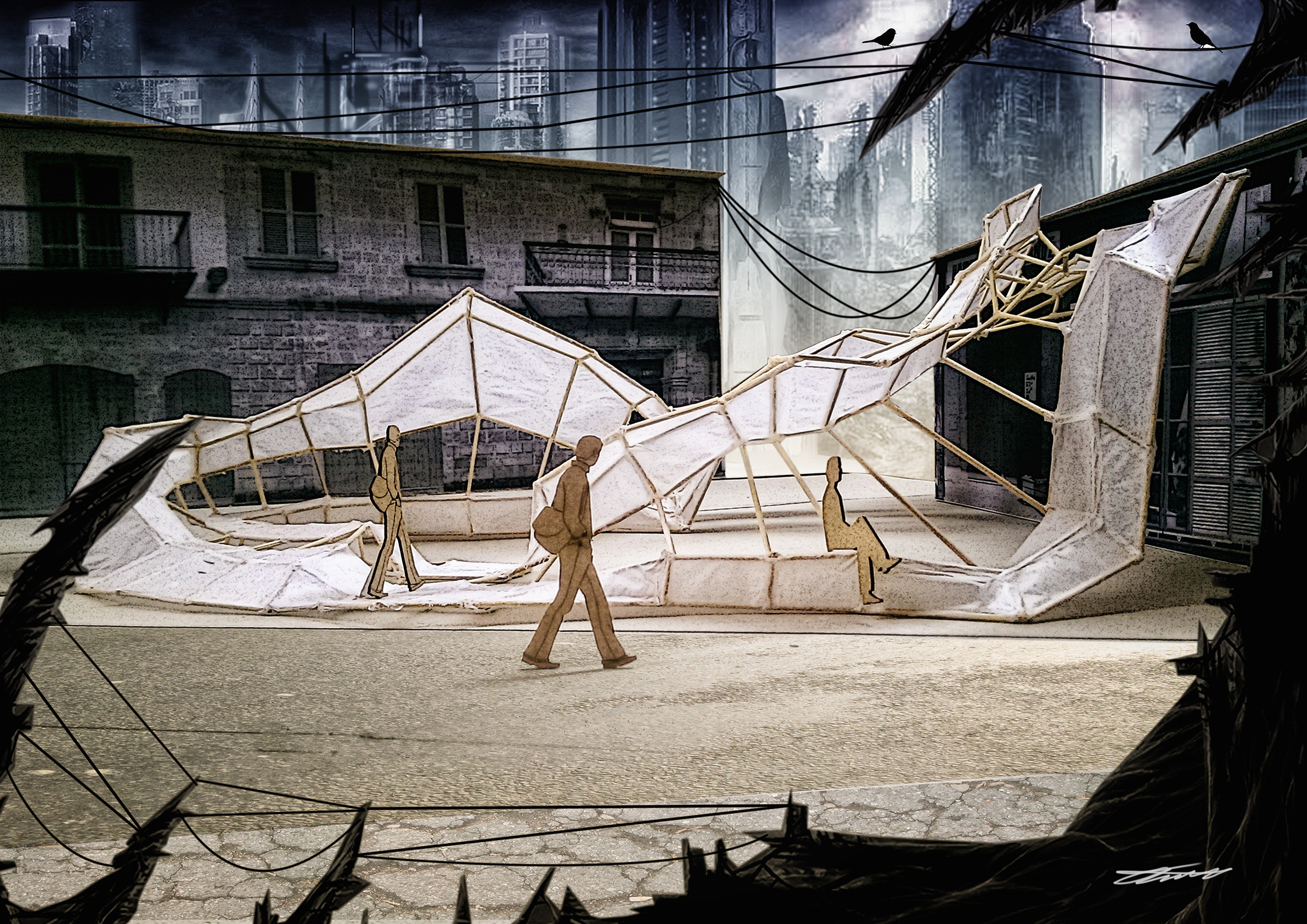
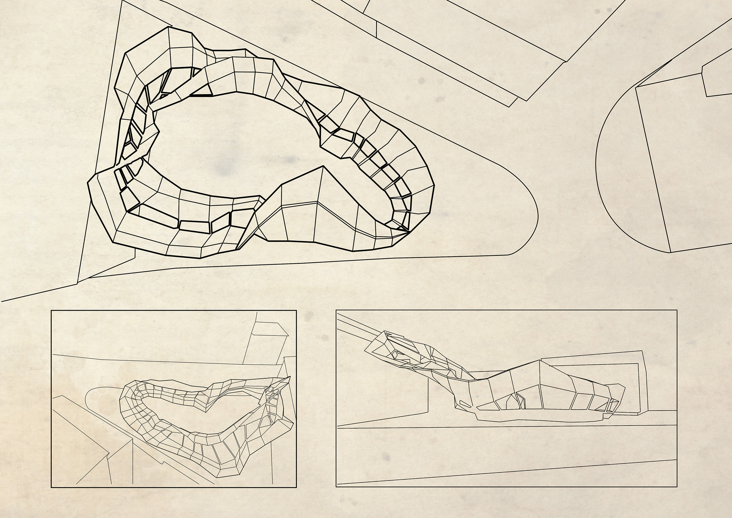
This was, for a few days at least, considered to be the final idea for the site. At least until I looked at it with a fresh pair of eyes a few days later. Following discussions with the tutors of the module, and reconsidering the overall form, I opted to incorporate the essence of the move (i.e. jumping, landing, crouching, jumping again etc) in a more considered fashion while also introducing continuity into it. This lead to a sort of structural Mobius strip, where shelter turns to a seating area, which then turns into an area you can lie down in, all while affecting the way people would traverse the square, while not limiting line-of-sight with something too invasive.
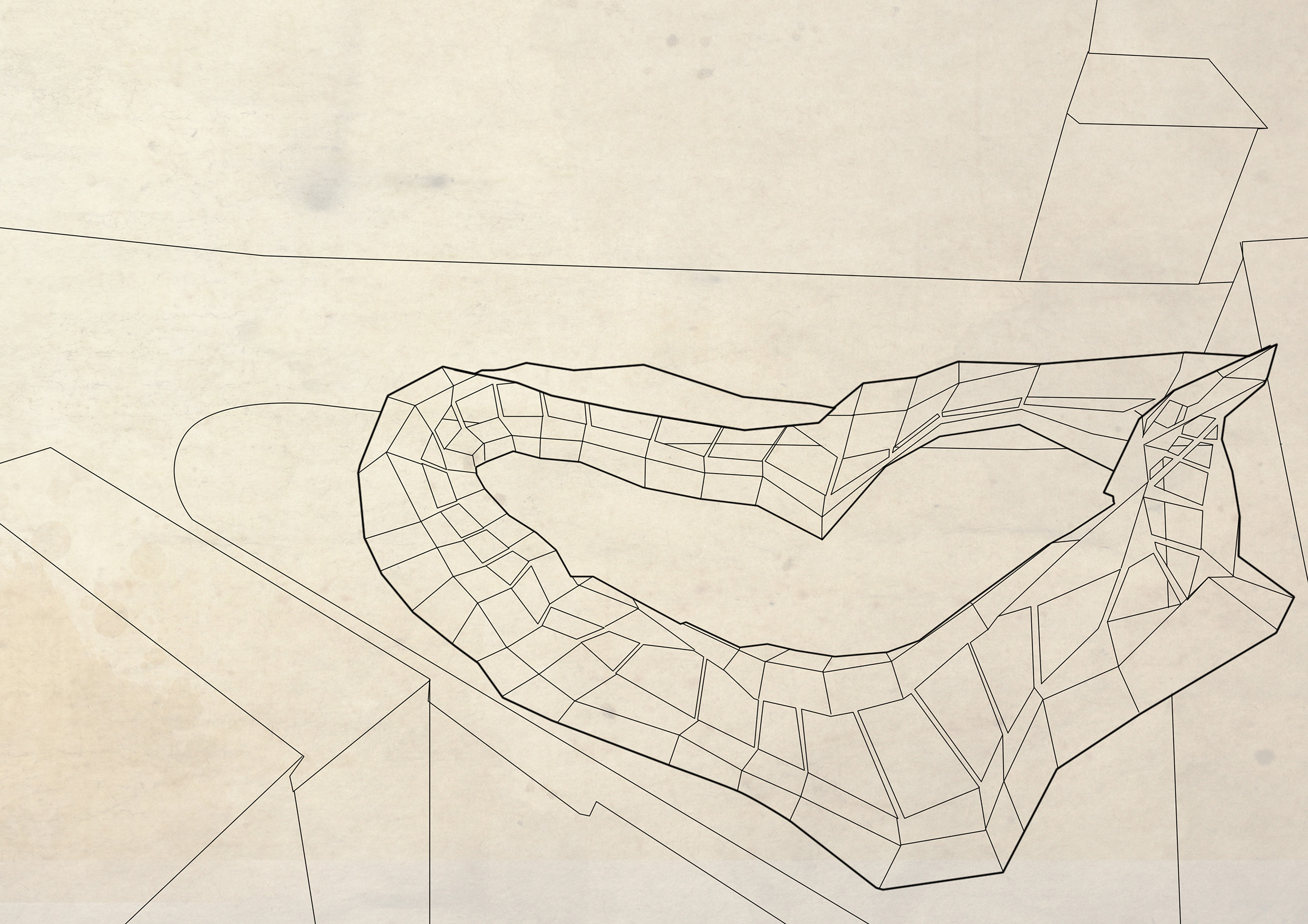
The structure was placed into a scale model of the site to take photographs which would have been the base for the final idea presentation :
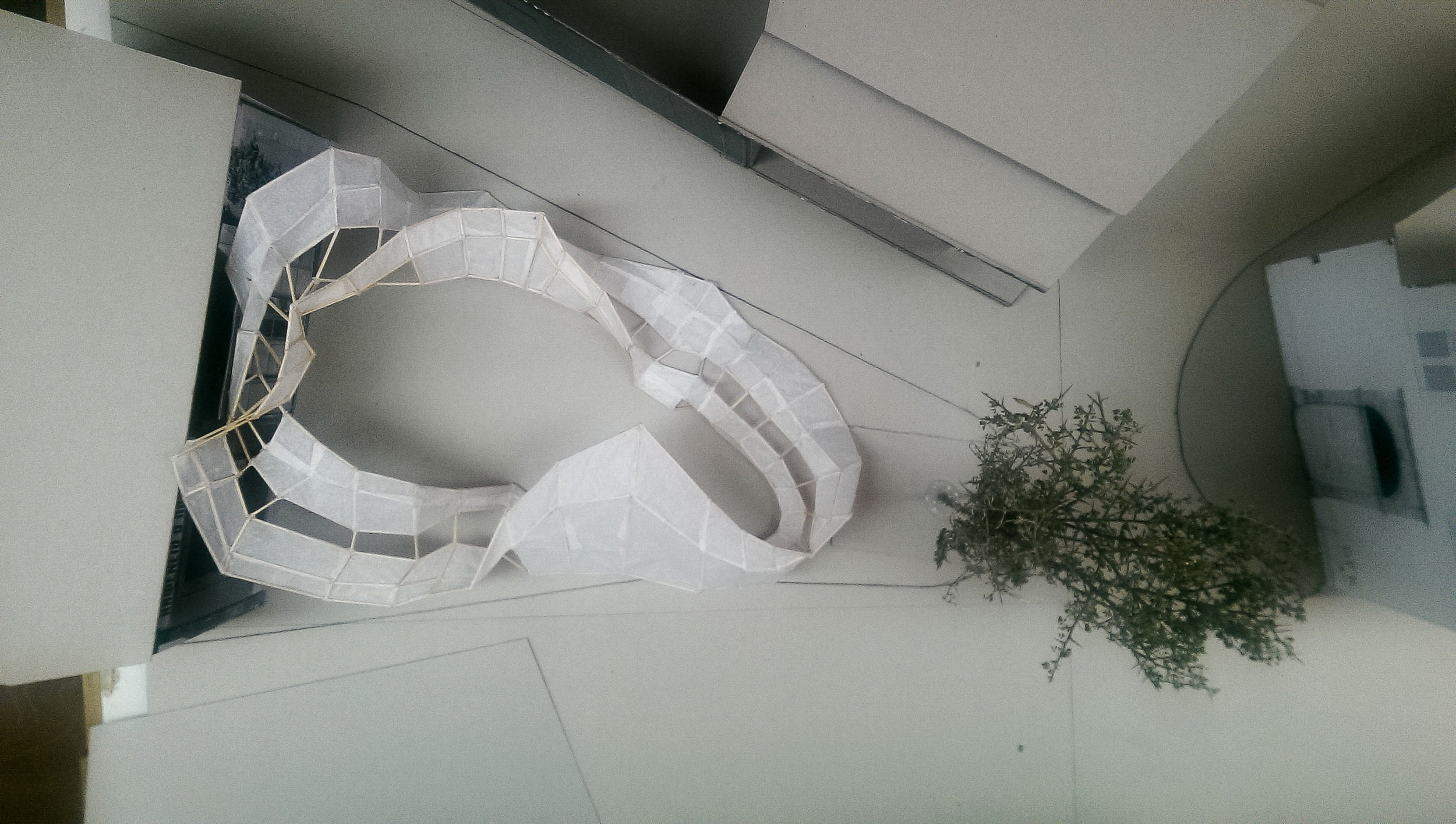
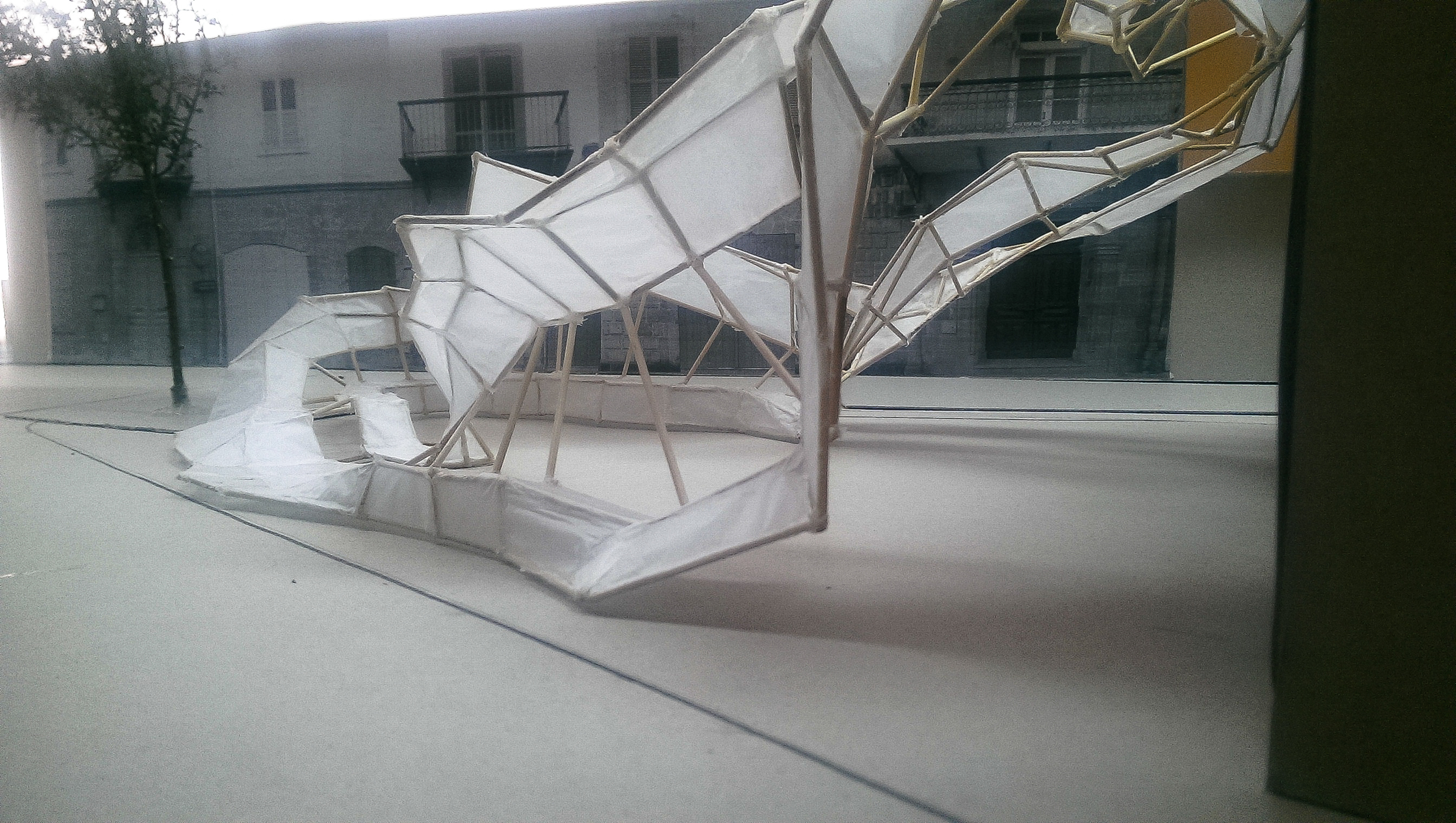
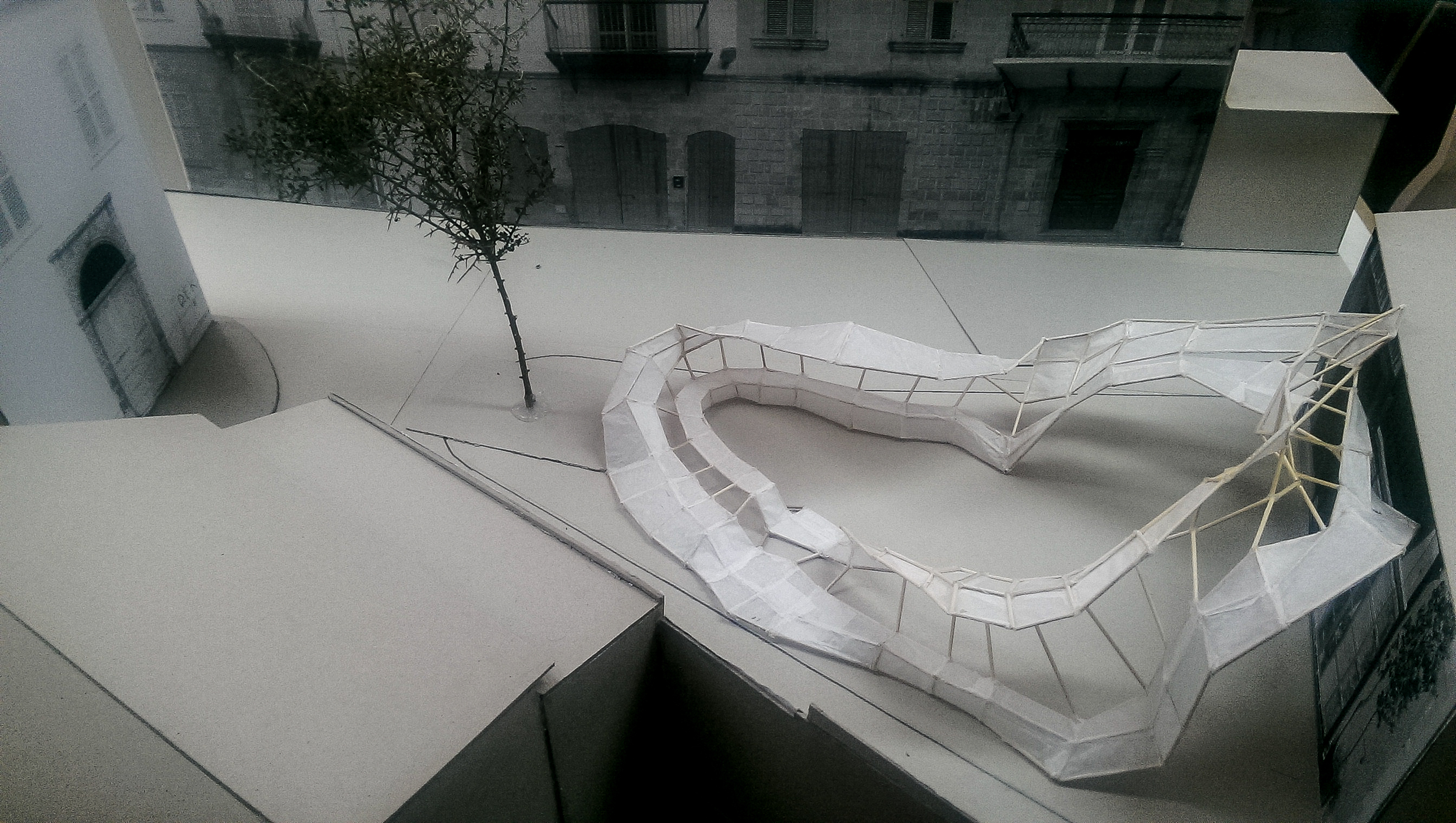
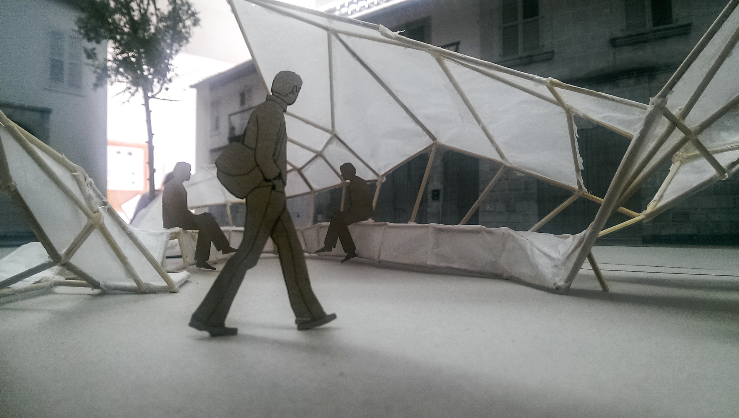
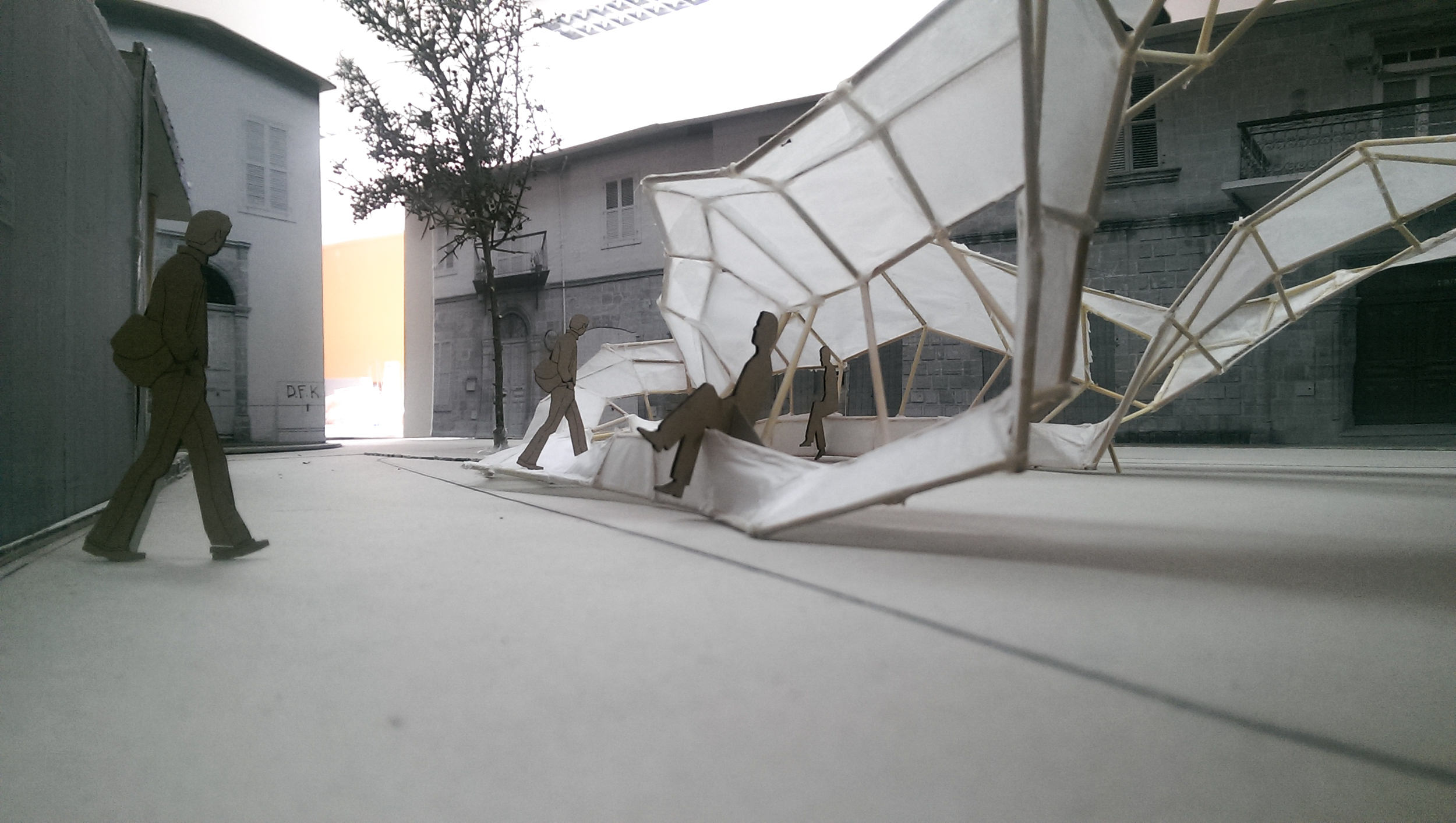
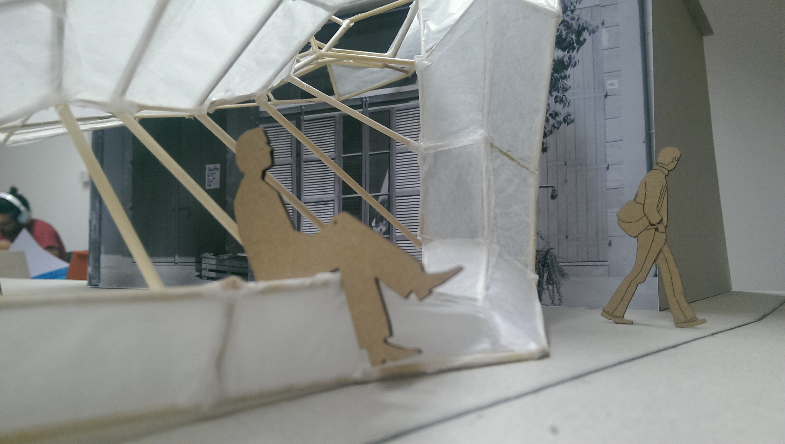
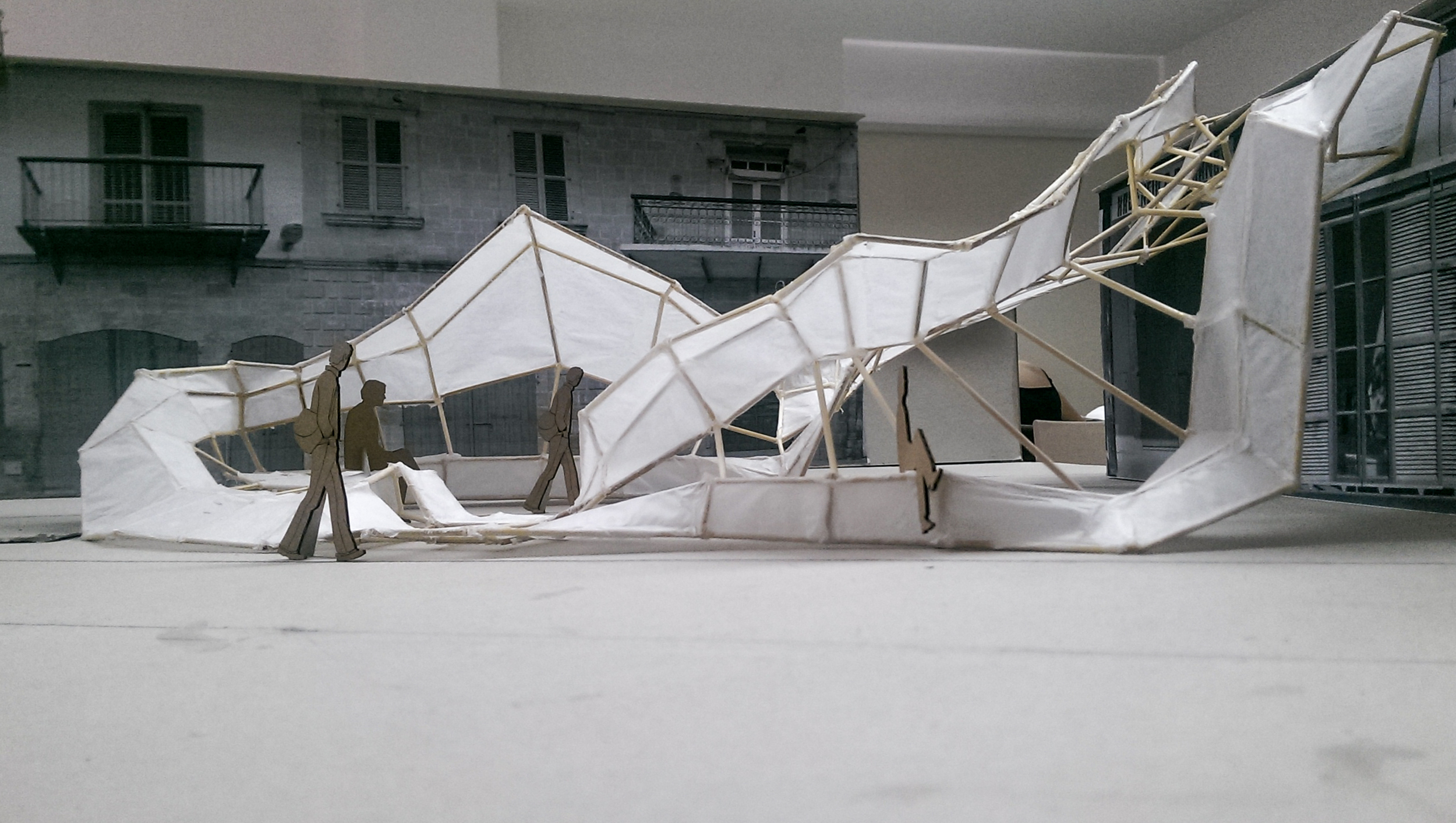
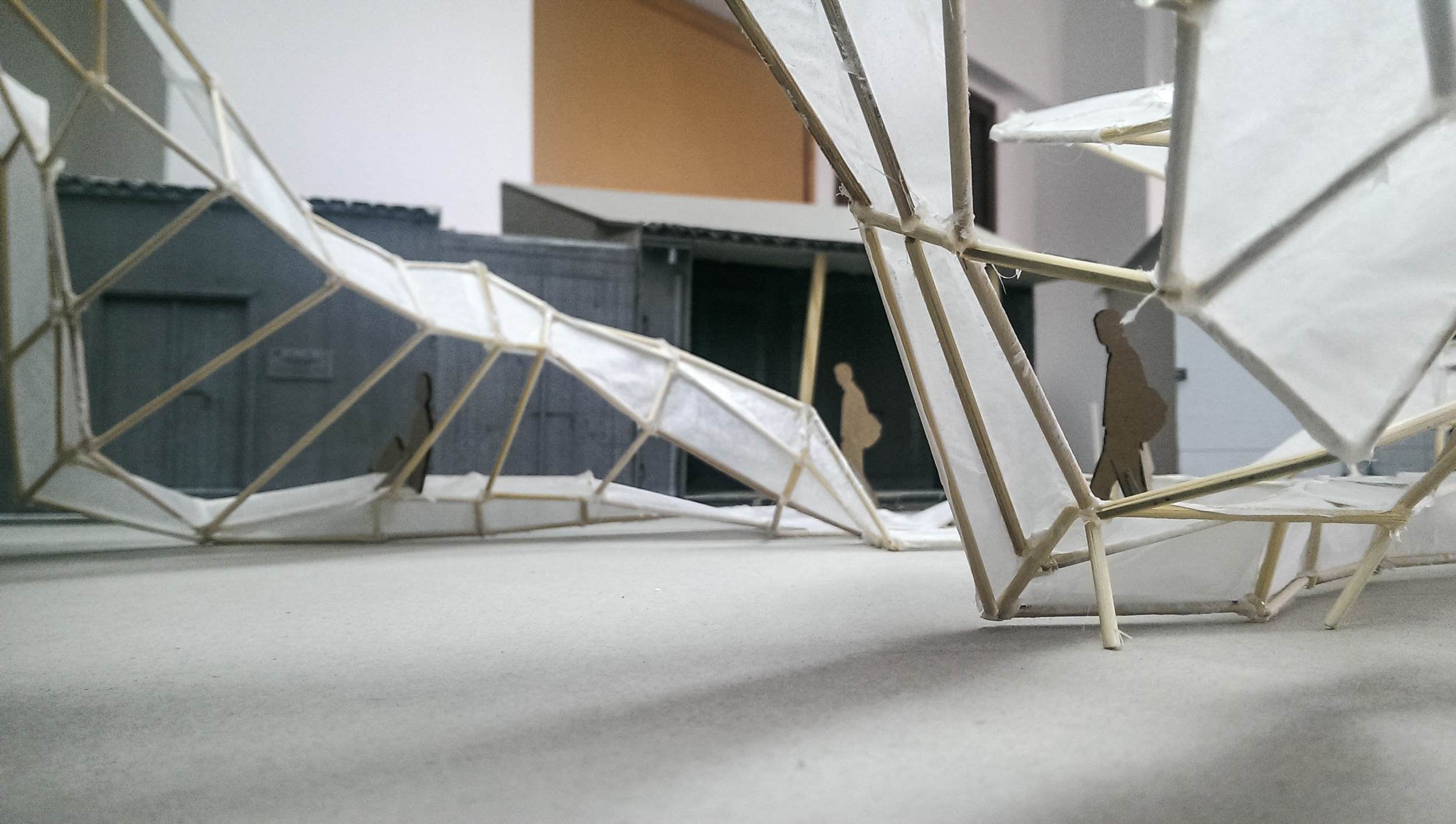
As evident from the images above, the idea practically engulfs the entire area and begins providing suggested routes of traversing the square while providing areas of interest and usability. The northmost side of the structure has been elevated to provide a barrier to sound while ensuring shelter from potential rainfall or intense sunlight. The west most side (closest to the tree) provides a seating/lying down area, while the east side remains elevated, resting on the cafe's roof so as to not inhibit traversal across the square. Finally, to cater to a recognized bus stop at the south side, a sheltered seating area has been formed.
These photographs were then edited into what I had then dubbed 'Manic Depressive ArchViz' in the following final idea presentation gallery :
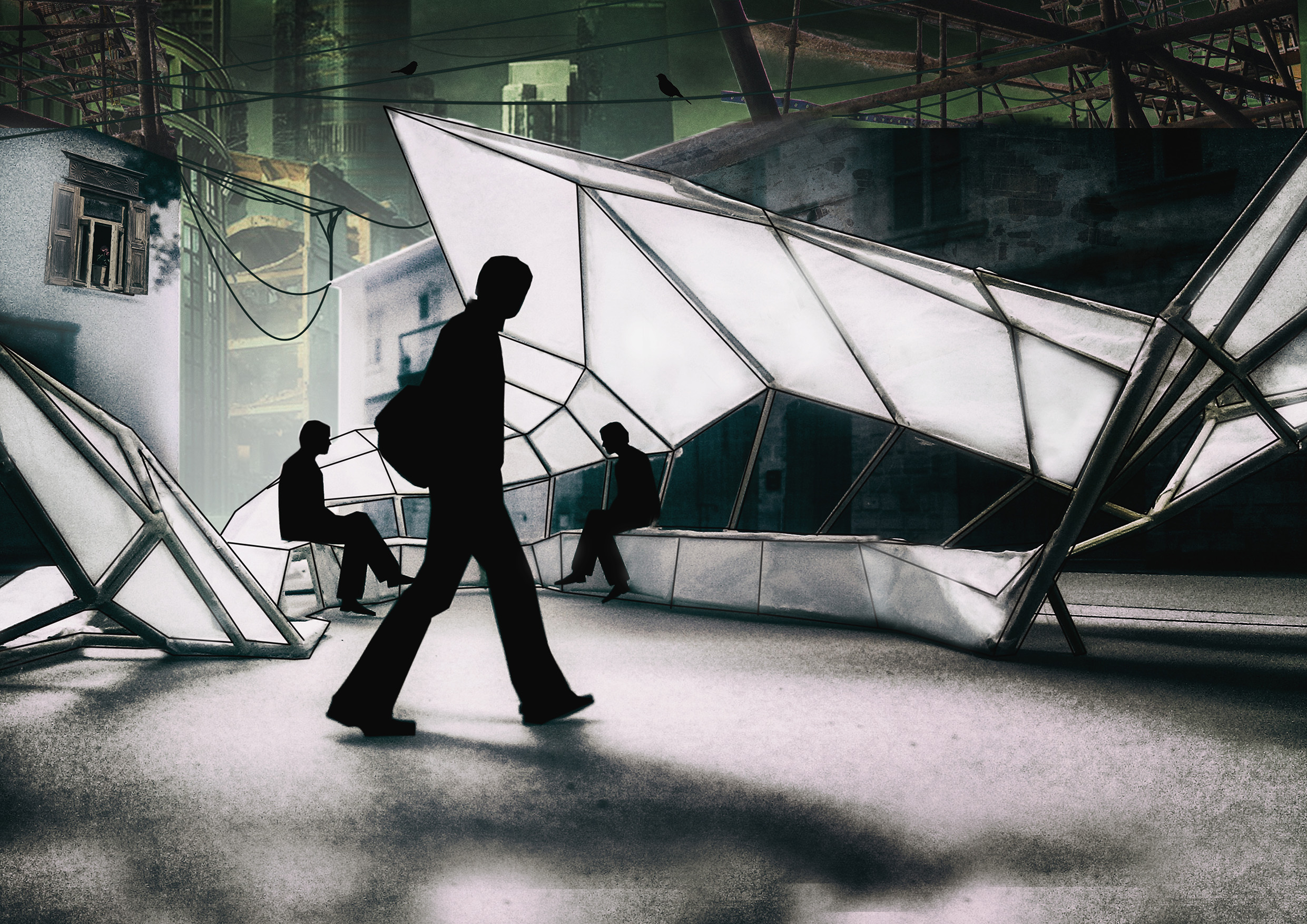
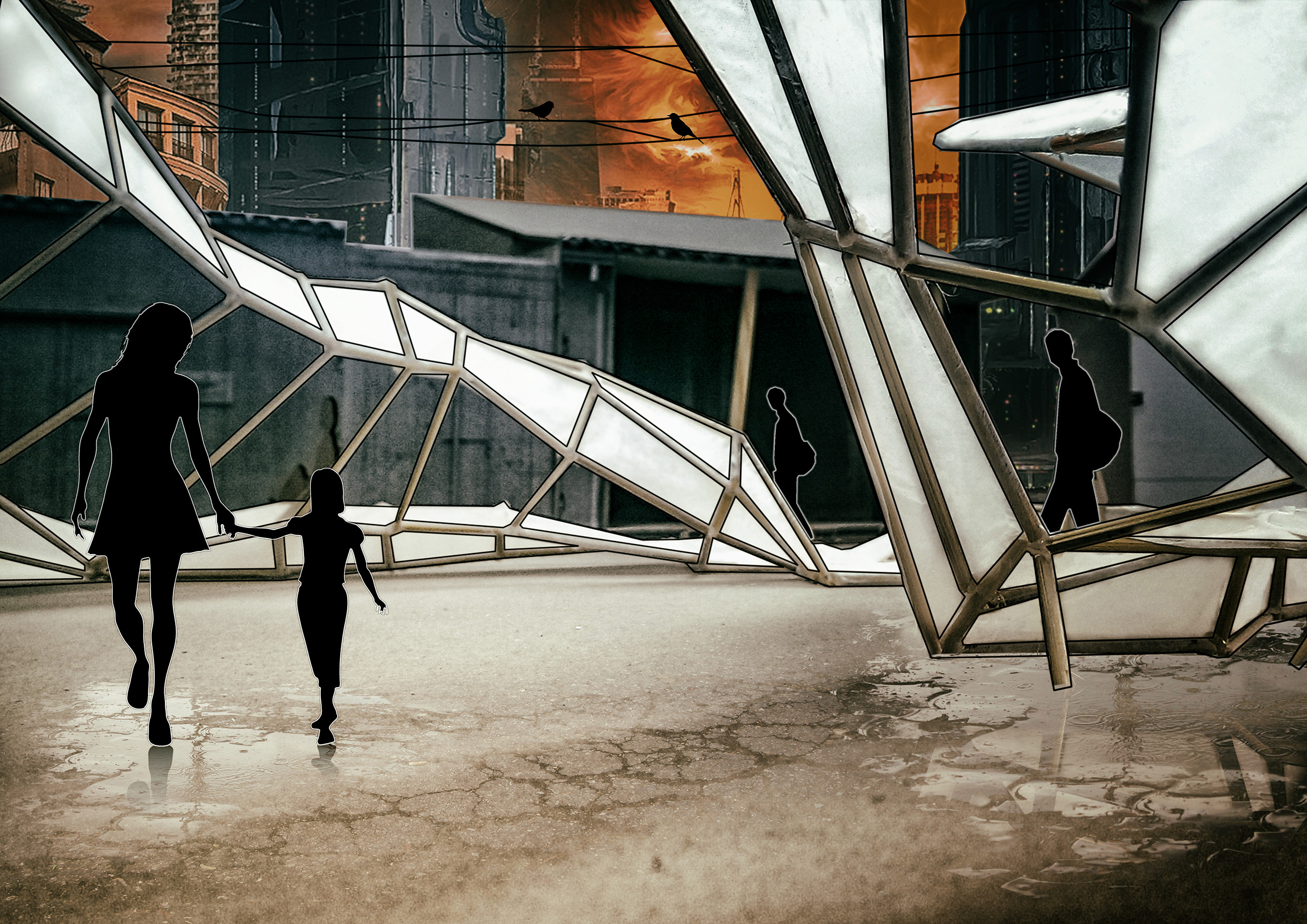
That pretty much sums up this first module. I sincerely hope that it proved to be helpful to aspiring first years out there and in general for people who are interested in a behind-the-scenes view of how architectural design could potentially work. That said, this was ONE approach and ONE methodology - the important thing is engaging in the flow of ideas and doing so in an aware and considered manner which hopefully leads to the creation of a final idea and a solid presentation of the suggested solution.
I'm including the final panels used during the critique presentation at the end of that year hoping that they prove to be helpful. Furthermore, if you enjoyed this five-part series please share the post and share the site with others. I'll be posting additional material and architectural in the near future, along with other creativity-based activities so check this site regularly and like us on Facebook for more updates. We'll be starting a newsletter in the near future as well so stay posted for that.
Until next time, take care and keep creating!